10 Most Misused Terms in Interior Design
If the visuals of interior design aren’t daunting enough, then there’s the language designers speak. The codified terminology, bits of jargon, the myriad different ways they’ll describe a chair, the seemingly endless eras and styles that get thrown around—it can all feel a little much.
Luckily, we’re here to clear up the basics. If you want to speak like the pros, first you need to know the common terms laypeople struggle with. Brush up on these definitions and prepare to impress.
1. MODERN VS. CONTEMPORARY
These two terms are the biggest mix-up in design speak. Even the pros can be guilty: They are often used interchangeably on design shows and online resources, and that makes it easy to get tripped up.
“Modern design” evolved from Modernism, the historical movement of the early 20th century, spanning across genres of design architecture art and more. New technologies in construction, particularly the use of glass, steel, reinforced concrete, plastics, molded plywood, changed the way furniture pieces were made (and what was desired). Think Bauhaus School, Eames furniture, Gerrit Rietveld’s Red Blue Arm chair, the Wassily Chair, Barcelona chair, anything Mies van der Rohe. The feeling was much more neutral and minimalist, thanks to the machine-made production.
Contemporary design, on the other hand, encompasses a range of styles from the late 20th century, with several key differenes from modern design. Think of contemporary design as a reflection of the current moment (which is sort of post-modern). You’ll notice more rounded and softened lines and more bold color than in modern spaces. But it’s ever evolving.
2. VINTAGE VS. ANTIQUE
Don’t let a salesperson fool you: vintage does not equal antique. An antique is a relic from the past that has considerable monetary value. Typically, the piece was created during a specific time period (aka Louis XIV, Baroque, or, more recently, Shaker folk work) that has now come back into popularity. A vintage piece, however, may not necessarily have any financial value. It’s something that was manufactured in the past, at least 30-50 years ago, and is now back in style. Case in point, vintage rugs might be just old and in fabulous shape, but an antique rug will cost considerably more—and require much more nuanced care.
3. LOVESEAT VS. SETTEE
A loveseat is typically between 55”-65” in size and considered any small-scale sofa that fits just two (hence the “love”). It’s meant for cuddling (or more dainty sitting).
A settee, while it can have the same dimensions, has a bench seat. Loveseats could have split cushions or all manner of upholstery, but a settee will always have a single cushion making up its seat and may provide seating for up to three. Settees are also more apt to have wooden legs/arms (think the type of French Louis XIV settee you might see in an entryway or breakfast nook).
4. ACCENT CHAIR VS. LOUNGE CHAIR
A lounge chair is normally deeper in size than an accent chair, and sorry to be so on the nose about it, but it’s made to lounge in, relax in, and maybe even recline in. Their purposes is comfort (not that it means you need to sacrifice style).
An accent chair can run the gamut. They can be upholstered or not (if they are, they do tend to have a slimmer profile). Designers sprinkle them into a space to inject personality, color, pattern, or texture. If you’re looking at a cute vignette with a chair next to a console or tucked into a corner, you might be looking at an accent chair.
5. CHEVRON VS. HERRINGBONE
Chevron patterns had a big moment for bit, but faded out of fashion in fabric and moved to the floor.
Sort of. Both chevron and herringbone pattern floors are on the rise, but they are not one in the same. Hardwood floors arranged in a herringbone pattern are composed of equal size rectangular pieces. They are arranged in a zig-zag and staggered slightly with the end of each plan meeting the side of another. Chevron pattern floors resemble an inverted “v” with the pieces cut at the edges in a 45-degree angle, while herringbone has the distinct broken zig-zag effect achieved by using rectangular pieces to create the same pattern.
6. DAYBED VS. CHAISE
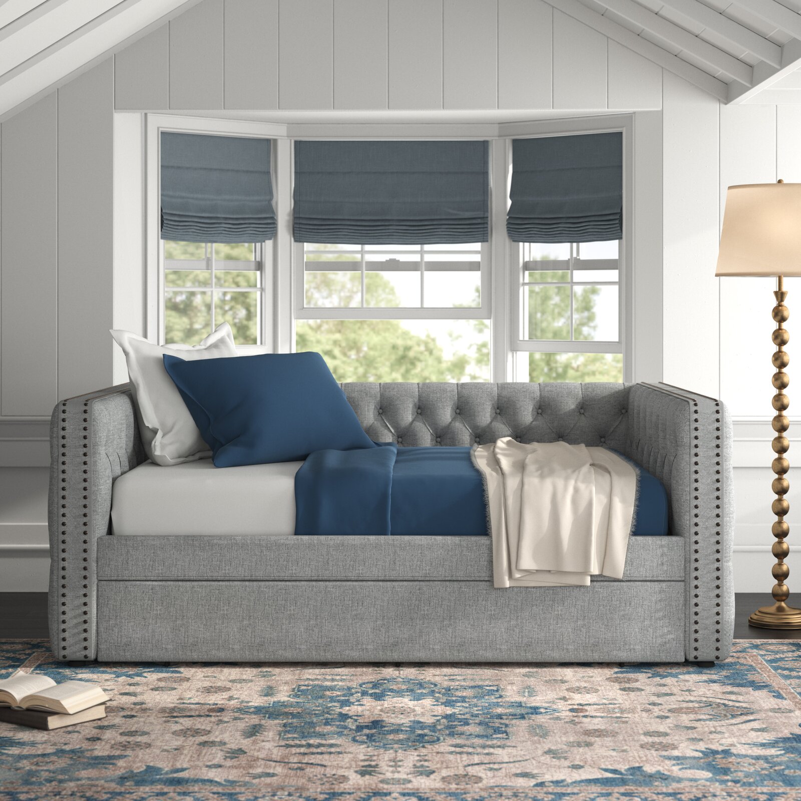
A daybed is exactly what it sounds like—a bed that’s used for lounging during the day time. These three-sided pieces typically features a twin-size mattress as the bottom cushion (though you can find the occasional full-sized option). They fit regular sheets and are perfect for home offices, petite living rooms, studios, or guest bedrooms.
A chaise can either be part of a sectional’s seating configuration (the “L” of the sofa) or a standalone piece of furniture. Literally “long chair” in French, they are typically around 65” deep. A standalone chaise lounge can float on its own in a room, and are often seen in luxe boudoir type-scenarios.

7. COFFEE TABLE VS. COCKTAIL TABLE
What’s the difference? Nothing, to be completely honest. A coffee table is normally 16-18” tall, and it sits in front of the sofa. Guess what? It’s the same for the cocktail table. The distinction of terms is more of an old school vs. new school terminology, Europe vs. America.
8. CURTAINS VS. WINDOW TREATMENTS
Window treatments encompasses the entire set of options from blinds, drapes, shades, etc.
Curtains refer to a specific type of window treatment, fabric panels that hang on rods all billowy and puddling on the floor. Imagine those old theater spaces with the rippling velvet fabric hiding the stage.
9. PENDANT VS. CHANDELIER
A pendant is a light fixture that hangs from the ceiling with one cord. Pendants come in many shapes and styles, with the most iconic being a simple drum shade (a stout cylindrical shape).
On the other hand, a chandelier typically has lighting that branches off via cords or arms. When you think of the big bold dining room lighting fixture, this is it. While there are plenty of the classic French-inspired chandeliers in the world, brands like Lindsey Adelman and Apparatus are challenging those conventions. Sia should be proud.
10. ECLECTIC VS. MAXIMALISM
While these terms are often used interchangeably, they don’t mean exactly the same thing. There are eclectic minimalists in the world, and here’s how that can be true.
Eclectic means a mix of styles and periods—a little Mid-Century Modern here, a pinch of transitional, some global influences, etc. Maximalism isn’t about the mixture, it’s about the amount. Densely layered spaces with copious patterns, lots of accessories, or exceptionally bold choices that feel distinctively over-the-top qualify as Maximalist. You could be Maximalist and hew just to one style, but you often see those who want more wanting more from all over.
The post 10 Most Misused Terms in Interior Design appeared first on Décor Aid.


