Plumbing experts warn against the Pancake Day mistake that could cost you £300
You might want to think twice before doing some unwanted drain damage
It’s no secret – interior design projects don’t come easily these days. Even in social media, things can get crazy busy it’s a feat to get yourself some decent and profitable attention. Still, you can’t deny that social media is where business rolls these days. Maybe you just need to focus on the right channels instead of throwing your efforts everywhere, and as an interior designer whose talent is best captured in pictures, Pinterest is your game.
Of course, even Pinterest is no magic bullet. As a professional marketing your services, you need to have a system for things to work. Once you establish that system, the site will practically haul in interior design client leads even as you sleep.
Here’s our guide to leveraging Pinterest for interior designers…
Indeed, why Pinterest in particular for your interior design business? People go to Pinterest for images for starters. Compare this with Facebook, even Instagram and all the rest, where there’s at least equal parts visual and a whole lot of other stimuli.
Pinterest is all about the pictures, which perfectly rhymes with your talent being best manifested in the said form. But make no mistake. People on Pinterest aren’t there just for the eye candy. Usually, it’s because they have something in mind, a project they plan to undertake, probably an interior design project they need professional help with – which is exactly where you come in.
When you invest in fantastic images of your designs and flaunt them them where the interior design clients hang out on social media, you get free traffic to your website and possibly straight to your sales funnel. Of course, you can always market your designs anywhere, but what’s the point if the business isn’t there? The idea is to pick your best channels and build a profitable audience there.

There’s no question about Pinterest being one of your choicest picks, but before you start pinning like a machine, remember, SYSTEM. You need a system, and it all begins from the bottom:
This is fundamental. Don’t start yet until you have this set up. It’s easy though as all you need is a form through which you can collect people’s email addresses. Make sure that form is on each page of your website pinned to Pinterest or in your site’s or blog’s footer. In any case, make sure it’s visible enough.
When you’re done with your list, set up your freebies, which should be automatically sent to each new prospect you list. And don’t forget to set up your autoresponders so you can maintain connection with your leads on auto-pilot.
Aside from catchy, professional pictures, you also need same-level content to impress some serious lookers. After all, you probably won’t be the only interior designer out there, but with a really clever headline, you can quash your competitors and take people to your awesome content in your website.
A Pinterest business account is more than telling people you’re mean serious business. It gives you access to the site’s analytics, or simply data that show how your pins are doing, how many people are checking them out, how many clicks you’re getting on that link to your website, and so on. Aside from analytics, a business account also gives you access to many other tools that help you establish your professional presence on the site and social media in general.
Once you have completed your business profile, you can link it to your personal account (up to 4 business accounts per personal account) and switch between the two as you like. If you plan to access an ad account through a business account, it’s better to use your work email and your real name rather than your business name so advertisers can easily identify you.

Of course, it’s smart to keep all of your images pinnable, whether in your blog or website. And try to maintain a constant feel to your pictures so you can create a visual mark that lets people recognize your images even without your logo (or any expressed indication they’re yours).
Yes, you should use keywords on Pinterest too. While your pictures will pique your potential clients’ interest, it’s keywords that will make them find you. Pinterest is essentially a search engine, and if you want to be found, especially for the right reasons, you have to use the right keywords in your description. Remember, DESCRIPTION (hashtags are obsolete).
Don’t forget that aside from you being an interior designer and Pinterest lookers being potential interior design clients, other things are happening in the world. In short, don’t just make your boards about interior design. If you work with out-of-town clients, for instance, create a board that feature your travels. If you have a passion that many people can relate to, such as cooking or a popular sport, create a board on them too. At the end of the day, you’re humans and it’s human connection that lasts between you and your client.
If you don’t have time to pin everyday, use a scheduling service that lets you put those pins out automatically. There’s no hard and fast rule on how many pins you should have per day, but 5 is usually a good start. Besides, Pinterest has begun using a smart feed system, which means you don’t have to worry about annoying people with too many pins.
It’s amazing how Pinterest has been around for a while and yet few interior designers have discovered it enough to take advantage of its benefits. Everyday is always a good time to start leveraging Pinterest for your business. But again, you can’t jump in without a plan.
The goal is to get word out about your interior design abilities and services in the most attractive way possible: pictures. By impressing people with your designs, you can get them interested enough to check out your website, and then you can start building that connection after turning them into subscribers. Offer them value, and when they appreciate it, send them an offer.
Of course, you can also rely on your past clients and referrals to grow your business, but why restrict your interior design network when you can create it without bounds? Pinterest helps you do that.
There are times when photos of a beautiful outdoor scene appear flat and dull, and that could be due to bad light, incorrect camera settings, or a myriad of other problems. You can always return on a better day, with your camera configured properly, but why do that if you can transform an unimpressive image into something really special with a few quick adjustments in Photoshop?
This tutorial from The Phlog Photography instructional YouTube channel demonstrates a simple color grading process that you’ll find yourself using regularly to make disappointing images really POP. It’s a very effective technique that does wonders for all sorts of outdoor photos.
German landscape pro Christian Mohrle walks you through the method he uses for such occasions in barely 13 minutes. Before clicking the “play” button we encourage you to download the sample image in the description beneath the video so you can make the adjustments yourself as he explains how it’s done.

Mohrle’s goal in the episode is to turn a flat seaside photo into a vibrant sunset image with a minimum of fuss. If you’ve watched Mohrle’s videos in the past, you know that he always starts with a few basic adjustments to make the image look as good as possible for the key enhancements that follow.
For this shot he begins in the Camera Raw editor to get the simple stuff out of the way. The image is a bit skewed, and he quickly aligns crooked verticals using tools found in the Geometry tab. He then changes the profile to Adobe Landscape which immediately provides nice base saturation.
Next come a few adjustments in Photoshop’s Basic tab. He increases White Balance temperature to warm up the tones, eliminates a magenta colorcast, and adjusts exposure for more details in the shadows.

After a few other basic adjustments Mohrle turns to the meat of the tutorial which involves straightforward masking to selectively enhance color in various portions of the scene. After a bit of sharpening, and a final tweak to the colors, the impressive transformation is complete.
You can find more shooting and editing tips on Mohrle’s popular YouTube channel—all designed to improve your outdoor photography.
And be sure to check out the recent tutorial we posted from another landscape photography expert, explaining why UV filters hurt more than they help when shooting outdoors.
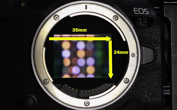
As manufacturers continue to introduce cameras with higher and higher resolution, many photographers are confused by conflicting advice about the key differences been models with maximum megapixel count and those with more modest sensors. As a result, many shooters are unsure of what camera to buy next.
If you’re struggling with this conundrum the tutorial below from one of our most trusted instructors is just what you need to understand how much resolution you really need. And there’s a good chance you’ll be pleasantly surprised by what you see.
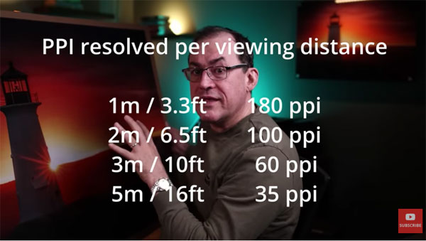
Canadian pro Simon d’Entremont specializes in wildlife and landscape photography, which is what makes this video so interesting, because landscape shooters typically want all the resolution they can get. In this episode he walks you through all the key variables to clear up popular misconceptions.

Simon begins with a few questions you may have asked yourself: “Do you wonder if the development of ever-increasing higher megapixel camera bodies are worth it and part of your photography future? Do you aspire to own one? Do you even need one for making big prints?”
He poses another relevant query: “Does the recent availability of upscaling software even-up the battle?” Simon answers these questions and more, and what you learn will help guide your next purchase, assist you in making the most of the camera you currently use, and may even save you some hard-earned cash.
Depending upon the type of images you shoot, the best camera for someone with a different style of photography may not be the best choice for you. And a quick glance at the description beneath the video reveals that Simon uses some pretty high-end gear.

Simon’s views on this controversial topic may be challenged by some. Nonetheless, the advice he offers is well worth considering.
There’s much more to see on Simon’s instructional YouTube channel, so take a look when you have time.
We also recommend checking out last week’s post, with a very helpful checklist for shooting the best possible landscape photographs.
