I thought I knew how to roll a towel until I tried these 4 popular hacks – one was a gamechanger
After this, I don’t think I can ever go back to standard folding methods
Just so you’re not confused, this is the second tutorial of the day from two German landscape pros with the same first name. This one is from Christian Mohrle of the PHLOG Photography YouTube channel—not Christian Irmler who is responsible for the earlier discussion on using different aspect ratios for more effective landscape photos.
As most Shutterbug readers already know, Mohrle is particularly adept at presenting editing tips for images with a unique look so they stand out from the crowd. Today’s episode demonstrates how to give images a soft, dreamy glow with few straightforward steps in Photoshop.
If you want to follow along as Mohrle explains the process, make sure to download his Raw file via the link in the description beneath the video. This technique works equally well whether you’re using Photoshop’s Camera Raw editor or Lightroom.

This interesting method makes use of “Negative Clarity and Negative Dehaze” to create the inviting effect. Like always, Mohrle begin with a few basic global adjustments to prepare the image for the selective adjustments that follow. The first step is changing the profile from Adobe Color to Adobe Standard to slightly lessen Contrast.
Mohrle then expands the Basic panel and modifies White Balance for warmer tones, further reduces Contrast, brings up the blacks, and drops the highlights. He also drops shadows just a notch. At this point he’s says, “The image looks quite good, and we now can make use of Negative Clarity and Negative Dehaze for a very, very dreamy, glowing effect.” As you’ll see, this reduces details in the image.
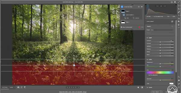
Now it’s time to open the Masking panel and get to work on a few selective adjustments. Mohrle is primarily interested in the foreground, and he employs a linear gradient for the simple adjustments. He brings up Contrast to make shadows slightly deeper, and increases whites to introduce more brightness to the brightness parts of the foreground.

Mohrle then adds a second liner gradient to the very bottom of the shot to further refine the results. The goal here is to restore details to this portion of the photo for a sharper look. He does this by restoring some of the Clarity he took away during the initial steps of the edit.
At this point the transformation is almost complete. All that remains is simple, color grading and careful dodging of the highlights. We think you’ll be impressed after comparing Mohrle’s before/after images.
There are many more helpful tips on editing outdoor photographs on Mohrle’s instructional YouTube channel, so be sure to take a look. We also recommend watching the tutorial we posted recently from another accomplished pro, explaining the best way to shoot landscape photos with an ultra-wide lens.
The concept of “aspect ratio” is a basic consideration regarding composition that can have a significant impact on how images are perceived. And there’s far more to this than you may realize.
Some photographers think all that’s involved is a decision to frame a scene in either a vertical or horizontal orientation. But as you’ll see in the tutorial below, there’s much more that factors into the equation. One is creative cropping, and another is whether to modify the native aspect ratio of the camera you use—which varies from one model to another.
German landscape pro Christian Irmler makes the emphatic claim that a thoughtful use of aspect ratio can make the difference between a world-class image and one that’s “just plain rubbish.” And while he explains this concept in terms of landscape photography, it’s equally important with just about every image you shoot.

The emphasis in this episode is the impact of aspect ratio on the viewer’s experience. He begins with the oft-ignored fact that different camera sensors lead to different aspect ratios. Full-frame and APS-C models, for example, typically have a 2:3 ratio, while the aspect ratio of micro four thirds cameras is 3:4.
The point here is that you’re not stuck with these default formats because they can usually be modified in the settings menu to render a scene in the most effective manner possible. Irmler demonstrates why “it doesn’t make sense to always use the aspect ratio given by the camera when crafting an image”—especially when the format be changed with a single click.
In other words, the aspect ratio you choose—especially when shooting landscapes—should be based upon what elements in a scene are important to include, and other elements you wish to exclude from the composition.

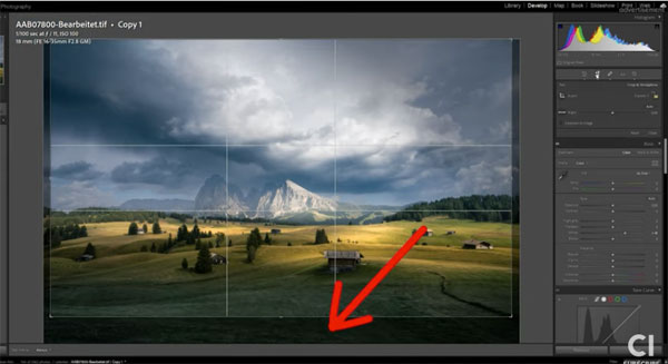
Thoughtful cropping is another way to adjust the framing if you don’t feel an image image you captured is as effective as possible after viewing it on the computer. Irmler has some important tips for doing it right. He also explains that most lenses are sharpest in the center, with a drop-off in quality at the edges of the frame.
That’s why Irmler prefers to crop a bit off both sides of an image when appropriate, rather that do more extensive cropping on just one side. He has several other great tips too.
You can find more helpful shooting advice on Irmler’s instructional YouTube channel, and in an earlier tutorial we posted with a simple guide to everything you need you know for making eye-popping photographs with long exposures.
