Amazon is selling a dupe for this cult IKEA buy – it’s cheaper and on sale for Prime Day
Snag this cult buy for less with this sweet Prime Day deal
If you’re serious about capturing the essence of your subjects and taking photography to the next level, developing better composition skills is a great way to start. In fact, understanding how to best frame a scene is one of the essential fundamentals of our craft. That’s the topic of the quick tutorial below from the Camera Focus YouTube channel.
Instructor Terry Copper is a professional landscape photographer known for his adept visual storytelling. In today’s 11-minute episode he reveals secrets to his success, specifically those related to effective composition that deliver attention-grabbing images.
He begins with this question: “How can we effectively arrange the vital elements within a scene and establish a harmonious relationship with one another?” This pretty much sums up the critical nature of refined composition, and the answers he provides will greatly improve your imagery. He also covers the importance of depth of field, and the proper use of light and shadow.

Cooper discusses several “rules” of composition, and when to ignore them. You may have heard some of these before, like the Rule of Thirds and the Golden Ratio that Leonardo D Vinci used within his iconic paintings. There are other guidelines, however, that are less familiar but equally or more helpful.
According to Copper, “composition is the language of photography, enabling you to tell your story, evoke emotions, and guide a viewer through your image.” He summarizes the most common concepts for the uninitiated, beginning with the Rule of Thirds. As you may know, this involves dividing an image into a three-by-three grid by drawing two equally spaced vertical lines and two equally spaced horizontal lines. The trick is to place key elements of a scene at the intersection points of these lines.

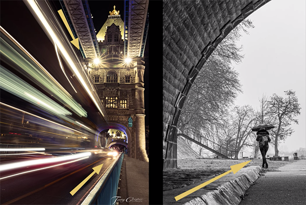
Another common method for composing compelling and dynamic images is to use leading lines within a scene that “direct a viewer’s eyes to a specific focal point or subject.” As you’ll see, by observing Cooper’s examples, these can either be physical lines or implied lines created by the arrangement of objects in the frame.
Things get even more interesting as Cooper delves into less familiar techniques for giving photos depth and adding a sense of movement and direction. He says these methods will “help create a visual journey for the viewer, leading them from foreground to background or from one point of the image to another.”
Cooper’s YouTube channel is a great source of information about outdoor photography, so be sure to take a look.
We also suggest watching a related tutorial we posted earlier, explaining the meaning of “visual hierarchy” and how to use it for perfectly composed photos.
It’s sort of amazing how many photographers are unfamiliar with Adobe Bridge despite everything it can do. In fact, last week we featured a tutorial explaining how to do a full edit in Photoshop within this oft-ignored tool.
We didn’t want Lightroom users to feel left out, so today’s video demonstrates how to use Bridge with Lightroom—or even by itself. Instructor Matt Kloskowski is an expert at all things Adobe, and the emphasis of this episode is “five things Bridge has that Lightroom doesn’t.
Kloskowski admits that five years ago, like many photographers, he often poked fun at Adobe Bridge. He’s since changed his mind—now using Bridge for much of his wildlife images. He says he’s convinced that these days there’s room for both Lightroom and Bridge in the workflow of many photographers.

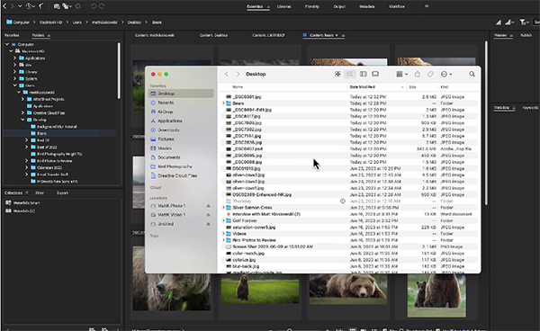
As Kloskowski makes clear, he’s not trying convert anyone from Lightroom to Bridge. Rather, by explaining the power of Bridge, you’ll be able to use both tools together to make editing a bit easier and more effective. One big advantage is you don’t have to import images into Bridge. That’s because they immediately appear once you click on a folder with the photos you want to edit.
With Lightroom, on the other hand, you have to go through the often-cumbersome import process before you can do anything. His second and related tip has to do with the fact that Adobe Bridge is a file browser, enabling you to quickly locate images within various folders on your hard drive.
While Bridge is a built-in component of Photoshop, things work differently with Lightroom, where Bridge is a free downloadable app that’s part of your Creative Cloud subscription. Metadata is another big advantage to using Bridge. Kloskowski notes that you’ll find basic Metadata on the right of the panel.

“Metadata nerds” have access to additional information by clicking the Metadata tab at the top of the screen. Here “you’ll be able to see Metadata at a glance, faster and easier for multiple photos”—with thumbnails of the images. And there are multiple view options from which to choose.
Kloskowski explains a few more reasons why you may want to give Adobe Bridge a try, including several customization options to make it best suit your needs. Here, he notes that Bridge “has a lot of flexibility that we wish we had in Lightroom.”
After watching the video pay a visit to Kloskowski’s instructional YouTube channel where there’s much more to learn about processing your images.
And if you’re a Photoshop user don’t forget to watch the tutorial mentioned above, explaining how to integrate Adobe Bridge into your workflow.
