Aldi introduces Jo Malone and Tom Ford-inspired diffuser scents for a fraction of the cost
For less than £4 each, how can you go wrong?
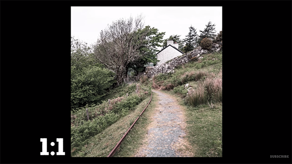
If you’re unfamiliar with the notion of “aspect ratios” it’s time to understand the concept. That’s because the shape of a photograph greatly influences how images are viewed. As you’ll see in the quick video below, there’s much more to this topic than just cropping a horizonal image into a vertical one to improve composition.
Instructor Mike Smith is a notable British landscape photographer who regularly posts behind-the-scenes tutorials demonstrating his favorite techniques, camera settings, and gear. By the time you’re done watching this seven-minute episode you’ll know everything necessary for choosing the best aspect ratio for whatever situations you confront.
Smith notes that aspect ratios have been an unwitting part of our lives; ever since the first time an artist put paint to paper, followed by the first image printed in the darkroom and the introduction of the first televisions and computer screens. More recently, when setting up a new camera, you’re given a choice of using the native aspect ratio (often 4:3) or changing it to 3:2, 1:1, 16:9 or something else.

It terms of photography here’s what you need to know to get started: Aspect ratios are expressed by two numbers separated by a colon; the first representing width of your photo, and the second indicating the height. Thus, a square photo has an aspect ratio of 1:1.
Smith goes into much more detail about what this means for your photography, how it influences whether you shoot in landscape or portrait mode, implications for cropping, and other important considerations. He also discusses his favorite aspect ratio “that the Internet hates.”
With all this information under your belt you’ll be able to decide the precise shape of every photo you make, whether it’s a portrait, expansive landscape vista, or anything else. This approach puts you in charge of exactly how your images are viewed and displayed.

After watching this very helpful lesson, take a look at Smith’s instructional YouTube channel for much more of the same.
And check out an earlier tutorial we posted from another accomplished pro, explaining how to create Golden Hour photos at any time of day with a simple Lightroom editing technique.
Today’s image-editing tutorial is for those of you who overlook the power of Photoshop filters when processing your work. Whether you’re a beginner or more experience photographer, this comprehensive lesson from the PIX Imperfect YouTube channel will quickly get you up to speed.
Instructor Unmesh Dinda is an internationally acclaimed post-processing expert with almost six million subscribers to his instructional YouTube channel. In this episode explains what filters are, how to use them, and demonstrates simple filters that create incredible effects.
Dinda also explores “the most essential filters for day-to-day editing” and provides real-word examples of how they can significantly enhance an image. He also supplies solutions for problems that may occur when applying filters, so you don’t get hung up with the process. As he explains, “Photoshop alters the image in some shape or form” in a controlled way, depending upon the filter or filters that you employ.

He begins with simple filters like Gaussian Blur and demonstrates how this tool enables you to do things like blurring the background of a portrait photo while keeping the subject’s face in focus. The result is a beautiful effect that makes the subject really stand out. And you can use the simple slider to do much the same with a variety of other types of images.
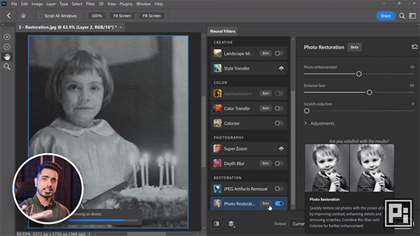
There are a number of Photoshop filters that work in more complex ways. One example Dinda provides is the use of Photoshop’s Neural filters to restore an old b&w family photo that has a bunch of problems. For this task Dinda selects the Photo Restoration option from the dropdown menu of Neural filters. This filter uses artificial intelligence and quickly removes most the scratches and significantly improves the damaged shot.
Dinda also discusses a variety of third-party filters and plug-ins that you can download and install. He explains where to find them once they’re installed; sometimes these are added to your list of Photoshop’s filters. Just like with the built-in options, third-party filters let you modify the effects they provide.

You’ll see what Dinda means by “Repeat Filters,” and learn how resolve problems with filters that don’t work as expected. He also demonstrates how to use a quick dodge-and-burn plugin to balance the exposure of an image, and a Camera Raw Filter that has several powerful options.
Dinda also includes a couple of interesting filter galleries to illustrate the wide variety of options available. One of these is a Liquify Filter that can be used to create interesting special effects. Be sure to watch until the end where Dinda provides a quick recap of the lesson with several more tips and tricks.
Whenever you get stuck while editing an image pay a visit to Dinda’s YouTube channel where you’re likely to find a solution or a better approach.
And don’t miss the helpful tutorial we posted from another post-processing expert, explaining. how to shoot, edit, and create eye-popping panorama photos in Photoshop.
If you’re disheartened by inconsistent photographs that don’t meet expectations you’re not alone. In fact, one of our favorite educators says many of his workshop students encounter similar common problems that are easy to fix.
Instructor William Patino is an accomplished landscape photographer who regularly shares the secrets to his success. In this 10-minute episode he provides five simple tips that he says will “help you improve your photography, break through the plateau, and start experiencing the joy of creativity.” And we all want to do that, right?
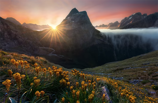
Patino’s straightforward advice comes from the perspective of a landscape photographer, but the techniques he describes will work wonders for just about any images you shoot outdoors. His first encourages you to “lead from dark to light.” As he explains, “darkness plays a huge role in leading the eye to light.”

An effective way to explore this method is to make sure that the main light source in a scene is near your primary subject, while trying to compose the image in a way that the surrounding areas, particularly the outer edges, fall in shadow or at least exhibit a darker tone. Doing this not only accentuates the key subject of the shot, but also adds dimension and depth.
Tip number three involves what Patino calls “layering up.” Here he means finding a composition that exhibits a variety of layers from near to far. Instead of filling the frame with one interesting object, Smith recommends pulling back a bit so that the image includes interesting elements throughout the photo. By doing this your image will exhibit far more depth.
Another way to assure optimum results is to create impact by using the right lens. A common pitfall is becoming addicted to using a wide-angle lens for every landscape photo you shoot. The problem with this approach is that “all your photos look the same”— with an over-emphasized foreground that leads to a background that looks small and far away. His point is that experimenting with longer focal lengths often delivers much more compelling images.

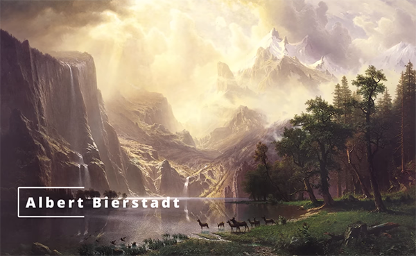
The lesson concludes with a discussion of “tonal range,” and Patino uses a 150-year-old landscape painting from master Albert Bierstadt to illustrate the concept. Patino draws your attention to the sense of dimension in this painting and explains how you can do much the same with your camera to create photos that almost appear three-dimensional.
There’s a variety on interesting lessons like this on Patino’s instructional YouTube channel, so make sure to pay a visit.
We also encourage you to watch the earlier tutorial we posted from anther pro, explaining why the unfamiliar Rule of Odds can deliver better photographs than the conventional Rule of Thirds.
