The #1 Mistake You are Making with Your Interior Design Photography
Interior Photography Tips to Make Your Next Design Project Magazine-Worthy
I review countless interior design projects per month over at my company, The Storied Group, a pr firm for interior designers. I always ask to see photos of recent projects as step one before we begin working with any new client. The biggest mistake I see designers making in their images (aside from simply not having enough images), is the use of mixed lighting.
What is mixed lighting in photography? Mixed lighting is when there is more than once source of light in any given photograph. For interior photography specifically, mixed lighting usually comes when a designer makes the choice to leave the lamps turned on—even though natural light is plentiful through a window. It can also mean recessed lights or pendant lights are left on.
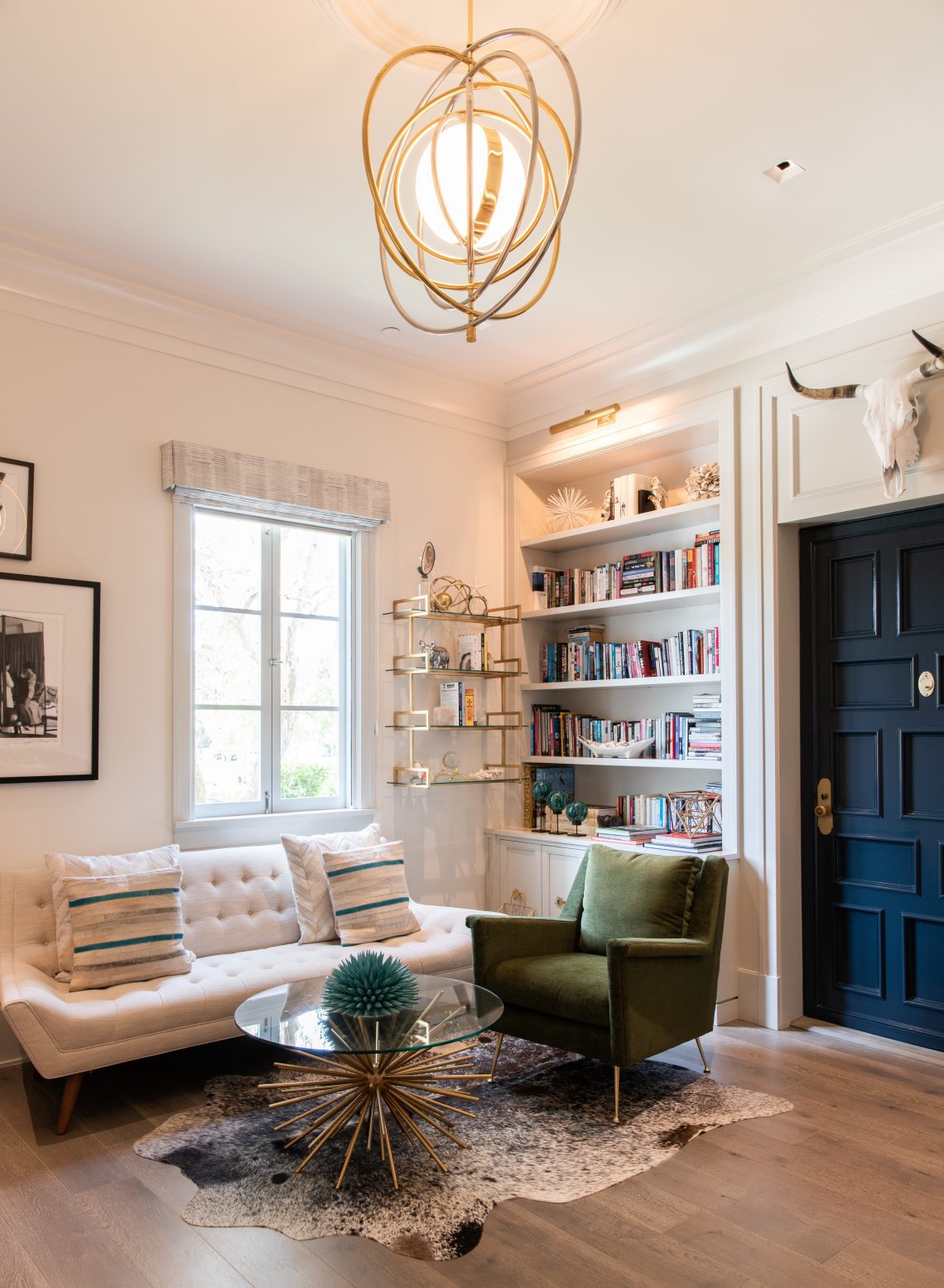
While some really talented photographers can get this right, more often than not, it doesn’t work. And rather than showcasing your beautiful lights, you are left with a yellowish tint to your images (see above image). Trust me on this, if you turn off all the lights and use natural light, your images will look way more magazine worthy.
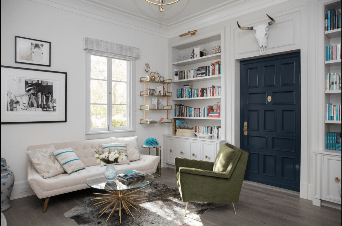
This image below is our same client’s office shot with only natural light. It ran in the Wall Street Journal as a full home tour.
You can find more interior pr tips here.
Want help getting your interior design project published in a magazine? I can help! We offer a project placement service over at my company The Storied Group. Read how the process works here.
The post The #1 Mistake You are Making with Your Interior Design Photography appeared first on The Sought After.

