
How Pros Nail White Balance and Eliminate Unsightly Color Casts (VIDEO)
British photographer and imaging-editing specialist James Feaver kicks off today’s eye-opening explainer like this: “One of the things I really struggled with when I started my photography journey was white balance. I would spend hours changing the color temperature and tint and I just never was happy with the results.”
This episode is for photographers of all skill levels who encounter similar problems and it’s guaranteed to shortcut your learning curve in the next seven minutes. Feaver explains why it’s a waste of time to guess, especially when processing images that we’re captured in a complex lighting situations like the urban environment with its wide variety of lighting sources from daylight and streetlamps, to car lights, and warm illumination streaming through windows.
Feaver begins by striving for a neutral color palate and he explains why in most cases “Lightroom’s White Balance Selector tool doesn’t always work.” That’s why you’re much better off by following the workflow he provides for achieving perfectly balanced tones under all types of light.
Feaver opens his demonstration image in Lightroom’s Basic panel, and the task of creating a neutral tone is made easy because in this case the photo doesn’t include vivid colors and the ceiling of his subject is gray. Other scenes are likely to be more challenging, but you’ll quickly understand how to handle those situations as well.
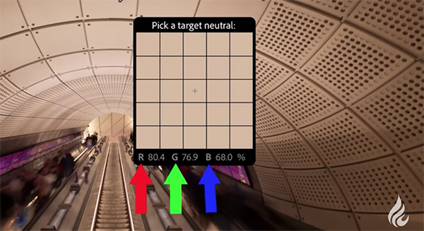
Here’s how Feaver’s quick trick addresses the issue: Open Lightroom’s White Balance Selector tool on the left side of your sliders, and hover over any swatch in the ceiling. The targeted picker then displays three values, red, green, and blue which represent a percentage of the amount of these primary colors found within that specific swatch.
Next he hovers around until these values are a bit closer to each other which makes it easier to achieve very precise results. As far as other images are concerned, Feaver says that it’s not necessary to identify areas that are gray, “they could be quite bright or quite dark as long as the area you choose has similar numerical RGB values.

At this point you’re barely halfway through the lesson and there are a few more important refinements to consider, but once you get the hang of it beautiful white balance will be yours.
Be sure to visit the Photo Feaver YouTube channel and explore the many how-to videos available.
And don’t miss the transformational tutorial we featured with another post-processing expert who demonstrates how Lightroom’s time-saving Adaptive Color Profiles beat presets and eliminate guesswork when editing outdoor photographs for a compelling, realistic effect.


