Today’s portraiture tutorial takes you behind the lens of an accomplished pro who shares several “essential tips for capturing breathtaking photos both indoors and outdoors.” Whether your’re just getting started making people pictures or you’re looking for ways to up your game, this quick lesson is just what you need.
These basic techniques can be accomplished with just about any gear you own, and instructor Jean-Philippe Desrois explains what to look for when shooting in a simple home “studio,” as well how to approach environmental portraits outside with available light.
Desrois cover a lot of ground in barely eight minutes so you may want to jot down a few notes as he demonstrates a variety of helpful suggestions. He begins indoors and helps you determine the best area in which to shot—like where there’s a large window providing indirect illumination.
He also describes the best background for your shot, and how adding simple props will contribute to the story you’re trying to tell. Skillful composition also plays an important role, and Desrois provides a few framing suggestions for impactful results.
Desrois likewise suggests how find an appropriate location when shooting in the field. You’ll see the elements he looks for and how to use sunlight to advantage when working with natural light. He also describes how to stay creative in any situation by adapting to changing weather conditions.
Another key aspect to all forms of portraiture is understanding how to pose models in a way that’s both comfortable and flattering. And this holds true whether your subject is male or female. Desrois provides several effective solutions that encourage confidence and help the model feel at ease and look their absolute best.
The discussion concludes by demonstrating how to experiment with various vantage points and camera angles that will provide a unique look and set your work apart from the rest. There’s much more to learn on Desrois’ instructional YouTube channel, so be sure to take a look.
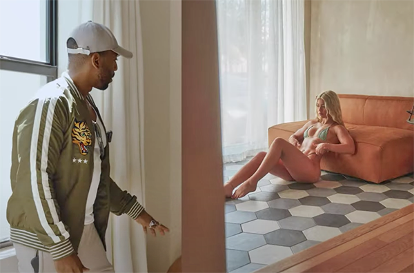
And for mastering the basics of shooting boudoir, a unique form of portraiture, be sure to watch last week’s tutorial with several tips from another accomplished pro who explains how to use available light to get the job done with perfection.
When first starting out we all faced a barrage of so-called “Rules of Photography” that supposedly would set us on the path for success. But as our skills evolved it became apparent that some of these rules we’re meant to be ignored.
Near of top of this list of conventional “wisdom” was the Rule of Thirds—still considered by many shooters to be the Holy Grail of photographic composition. In this tutorial, however, you’ll learn why one pro adamantly disagrees, and he insists that this particular rule is “really bad advice.”
Instructor Leander Hoefler is a very accomplished photographer who specializes in outdoor and travel imagery. He admits that the Rule of Thirds can be helpful in certain situations but says that it can often lead you astray and be detrimental to the images you create. He demonstrates how understanding and employing the the concept of “visual balance” is typically a far better way to frame up your shots.
As Hoefler says, “what you include, what you exclude, and how you position elements in the frame is ultimately the skill that separates a photographer from someone who’s just taking a picture.” He briefly describes the Rule of Third (in case you’ve been living in a cave), and then he provides three examples when it’s effective, and three others where the rule definitely falls short.
Hoefler also debunks the common notion that you should never place a key subject in the middle of the frame. The second half of today’s lesson is devoted to his technique for creating visual balance, the approach Hoefler uses more often than not. He recommends that you trust your artistic vision—and compose images in a way “that feels harmonious to your eye.”
Sometimes this means placing a subject in the middle of the frame which tends to create balanced images with a serene look. In other instances he’s motivated by establishing visual weight” when deciding upon a composition.
Here’s how Hoefler describes the latter approach: “If you push the subject to one side without anything to draw attention to the opposite side, the image becomes imbalanced and it’s important to reframe so there are multiple points of interest within the frame.” You’ll also see how the size and brightness of an element contributes to its visual weight.
The video concludes with a few more examples of Hoefler’s approach to effective composition. His interesting YouTube channel is well worth a look whether you’re a beginner or a more experienced shooter.
This has been quite a year for those of us who love astrophotography. The solar eclipse in April took a tour across North America. The Aurora Borealis crept unusually close to the equator multiple times this year. And just recently, the comet Tsuchinshan-ATLAS has been putting on a once-in-80,000-years show.