The liquorice colour combo is going to be 2025 most playful interior trend – here’s how to make it work
The result is effortlessly classy
German pro Christian Mohrle is a favorite among Shutterbug readers who appreciate his detailed tutorials for enhancing landscape imagery. Today he’s switching things up by applying his post-processing expertise to wildlife photographs that need some serious help from Lightroom.
Whether your subject is a local bird at a nearby park or an exotic big cat in the wilds of Africa, this 11-minute episode will make a significant improvement in your results. We suggest downloading Mohrle’s demonstration image with the link beneath the video so you can mimic his edit from start to finish as the straightforward steps are explained.
It’s obvious that this unimpressive shot must be completely rehabilitated to keep it out of the trash bin. The bird needs separation from the background, and there are three major areas of concern. The foreground is too bright, and the background is a bit too dark with rather flat light,
And there’s the subject itself which can benefit from more natural colors in the feathers and increased detail overall.
Mohrle initiates the process by heading into Lightroom’s Lens Corrections tab. Here he enables both the Remove Chromatic Aberrations and the Profile Corrections options. Doing so immediately minimizes lens distortions for a better looking image.
Now it’s time for several basic adjustments, and the first step is to completely drop the highlights to dramatically increase detail. Mohrle then opens up the shadows, pushes contrast by bringing up the whites, and modifies the blacks in a way that provides the soft, dreamy effect that he has in mind.
Mohrle wraps up the preliminary adjustments by removing a heavy green cast, boosting Texture, dropping Clarity and Dehaze, and bringing up Vibrance. The foregoing global adjustments were made without much attention to the bird, and this is where the important selective enhancements begin.
This step is the real meat of the tutorial as Mohrle employs masks to enhance his main subject in various ways without biasing surrounding areas of this very simple composition. He also adds a Linear gradient near the top and bottom portions of the shot to make subtle adjustments that accentuate the bird further.
All that’s left to complete this impressive transformation is thoughtful color grading and very careful sharpening. Mohrle’s before/after images illustrate the effectiveness of his technique. Once the video concludes take a look at Mohrle’s instructional YouTube channel where there’s much more to learn.
And don’t miss the tutorial we featured recently with another image-editing expert who explains why and how selective post-processing adjustments (not just global enhancements) are necessary for the best possible photographs.
Yesterday we brought you an eye-opening tutorial from a professional wildlife photographer who insists that a camera’s histogram may not be telling you the truth, and thereby compromising the quality of images you shoot. Unfortunately, there’s another harmful camera untruth, as you’ll see in today’s video from the f/64 Academy YouTube channel.
This episode begins with photographer Blake Rudis scolding his camera, and it goes something like this: “For as much as you lie to me I still can’t help but love you, so let’s go take some pictures.” The source of his disdain is unreliable Color Balance settings, and Rudis presents several examples to prove his point.”
Unlike your camera Rudis is a straight shooter, and he describes the dilemma like this: No matter how hard a camera tries it can’t give you perfect Color Balance because it doesn’t perceive color like our eyes do.” In other words, even the best cameras are just not capable of true color accuracy.
There are many variables responsible for this problem, and Rudis begins with a surprising example of his new eyeglasses that have blue-blocker lenses with a yellowish tint to offset the blue light emanating from his computer monitor. While evaluating his images he realized “there’s a lot about White Balance that we just haven’t talked about.”
He illustrates several more common concerns before jumping into Photoshop to demonstrate his methods for assuring that you get accurate colors almost every time. You may be thinking that none this doesn’t apply to you because there’s a color checker in your bag that enables you to capture photos with very precise tones.
Well, don’t fool yourself, because Rudis restates his claim more emphatically: “Your camera cannot, I repeat CANNOT, and never will give you the most accurate representation of color in any given scene—even if you’re using a color checker.”
Rudis provides a comprehensive discussion of the specific effects of light on both color and photographic prints. The then turns to Photoshop and demonstrates a basic White Balance fix, followed by more advanced techniques. He even explains what to do when your scene includes a rainbow that deserves a realistic appearance.
So watch the lesson and don’t get too angry at your camera because, “it’s not lying to you to be mean. It’s more like a child who doesn’t know what it’s doing.” Feel better? Be sure to visit the f/64 Academy YouTube channel where there are many more helpful episodes, though not as provocative, as this one.
Then check out the tutorial mentioned at the onset that demonstrates why your camera’s histogram may not be telling the truth and spoiling the quality of your photographs.
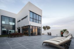
Let’s say you’re a commercial builder in the DFW area, designing and executing multiple projects like offices, restaurants, or retail spaces of all kinds. Each project is unique, but how do you maintain a cohesive visual brand across your marketing materials that reinforces your company’s identity? Consistency is key, not just in design but in how your brand is presented to the public.
Creating cohesive imagery across all your marketing materials, from websites and brochures to social media, plays a significant role in defining how clients perceive your brand. When your imagery is consistent and professionally executed, it conveys trust, reliability, and an established presence in the industry. Sharp Frame Media is here to support you by providing expert tips on how to maintain consistency when capturing and showcasing your projects.
In commercial development, imagery isn’t just about showing off what you’ve built; it’s about communicating your vision and expertise. If every project is presented with different styles, photography quality, or inconsistent branding, it can dilute your message and confuse potential clients.
Consistent visual branding does three major things:
Repetition breeds familiarity. When people see consistent imagery tied to your brand, it becomes easier to recognize your projects anywhere in the city. Whether it’s a restaurant in Deep Ellum or a retail space in Uptown, your brand becomes synonymous with quality.
Sharp, high-quality images tell potential clients that you’re professional, detail-oriented, and committed to delivering exceptional work. Whether it’s a sleek office space or a cozy café, consistent photography showcases your ability to maintain excellence across different project types.
Commercial development is an investment, and clients want to work with builders they can trust. Consistent imagery that aligns with your brand values communicates that you’re reliable and capable of handling multiple projects with the same level of care and expertise.
To build a consistent visual brand for your commercial projects, you need more than just great design—you need professional photography. At Sharp Frame Media, we specialize in capturing your work in a way that aligns with your brand’s message and style. Here’s how we can help:
Whether you’re photographing a restaurant or an office space, we ensure every image reflects your brand identity. Our team captures the unique elements of your spaces while maintaining a consistent style across all imagery.
By keeping lighting, angles, and composition consistent, you present your commercial spaces as a unified portfolio, helping you stand out in the competitive market.
When you work with a skilled photography team like Sharp Frame Media, you can trust that every shot—from lighting to composition—is intentional, reinforcing the high standards of your brand.
For commercial builders in the Dallas-Fort Worth (DFW) area, maintaining consistency in visual branding is crucial for long-term success. It ensures that your projects not only stand out but also connect with clients on a deeper level. By investing in professional imagery and maintaining a cohesive visual style, you build trust, enhance recognition, and communicate the professionalism that client look for in a commercial developer.
When you’re ready to level up your brand’s visual identity, Sharp Frame Media can help you capture the essence of your projects and reinforce the message you want to send out to the world. Visit Sharp Frame Media to learn more about our Commercial photography and videography services in the Dallas-Fort Worth area, or contact us today to discuss how we can help you.
Here are other related topics that might interest you:
Sharp Frame Media is a 5-star rated real estate media agency servicing Dallas-Fort Worth, and surrounding cities in Texas. Founded in 2015 on the values of craftsmanship, service, and partnership. As a veteran-owned company, our mission is driven by our commitment to unmatched service.
Want to Learn More About Sharp Frame Media?
The post Creating A Consistent Visual Brand For Commercial Spaces appeared first on Real Estate Photography in Dallas-Fort Worth.