
How to Use BOKEH for Photos that Grab Attention (VIDEO)
Regardless of how you pronounce “bokeh” (see our hilarious video on this topic), it’s an important concept to understand if you want to shoot photos that grab attention by making the primary subject in a scene really stand out against a soft and pleasing background.
Not to be confused with background blur, bokeh describes the out-of-focus areas in an image—or more specifically, the quality of these areas within the frame. In the quick video below from the Photography Course YouTube channel, you’ll learn what causes bokeh, the difference between good bokeh and bad, and how to use to accentuate key portions of a photo.
This straightforward tutorial is episode #26 of the “52 Week Series” that simplifies basic photography concepts with quick weekly lessons. By watching today’s video on bokeh, you’ll become a better photographer in barely five minutes.

Instructor Taya Iv puts it like this: “Bokeh is basically out-of-focus circles that appear when you use a wide aperture on your lens.” It’s an effective portraiture technique whereby a model is sharp, but the background has smooth circular areas that are more interesting than flat blur.
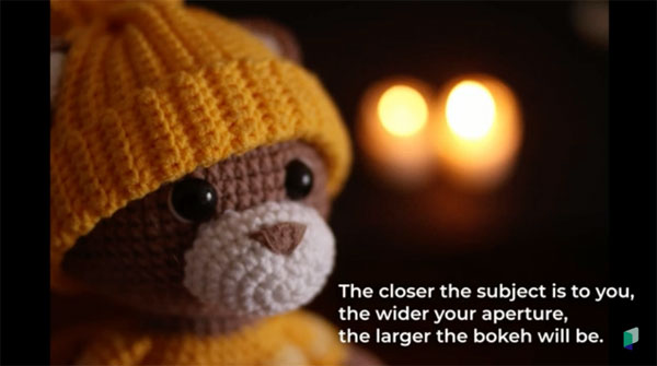
The first step in achieving this pleasing effect is setting the lens to the widest available f/stop. But as you’ll see, there’s more to it than this. Other considerations include camera-to-subject distance, the focal length in use, the position of your subject, and how he or she is lit.
And then there’s the imaging characteristic of your lens, which is why many photographers purchase lenses known for creating beautiful bokeh. And this applies to new modern glass as well as to hard-to-find vintage “bokeh monsters” from the past.
Iv pulls all these variables together, while explaining how to get the job done, whether you’re shooting outside in natural light or using a supplemental source of illumination. Bottom line: by following her advice you’ll quickly take your photography to the next level.
You can find more interesting videos on the Photography Course YouTube channel, including past episodes of the 52 Week Project, so be sure to take a look.
And the next time you need a laugh, check out the funny video we posted regarding the proper pronunciation of “bokeh.”


