Photo Contest with Big Prizes is Judged by AI
To celebrate the 10th anniversary of their AI-powered photo-management software, Excire is sponsoring People in Focus, a free-to-enter contest for people of all skill levels. The contest started June 1, 2025 and runs through June 30th. A total of $7000 in cash prizes is being awarded. That’s a serious purse, but what makes People in Focus unique is the umpiring. The competition is being judged entirely by artificial intelligence.

AI Trained by Expert Photographers
Excire’s in-house AI model has been trained by expert photographers to evaluate each image based on aesthetic characteristics. This allows for instant scoring, as well as a live leaderboard that updates in real-time.

Get to Know Excire
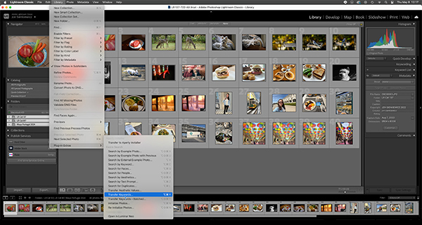
Excire Foto 2025 is a standalone digital asset management utility that assists users in organizing, searching and accessing their images and videos. Excire Search is a Lightroom plugin with most of the same capabilities. Both leverage powerful AI technology to provide features such as text-prompt search, facial recognition, GPS search, and searching by the keywords you previously assigned. Excire also delivers potent culling functions based on parameters like sharpness, subject type and similarity.
Excire Foto 2025 also can perform AI-powered aesthetic ratings, a feature that’s being leveraged in this contest.
For more information about Excire Foto 2025, read this resent Shutterbug article: Clean Up Your Photo Library Mess with Excire Image Management Software.
Excire offers 14-day free trials for their standalone program, Excire Foto 2025, as well as for their Lightroom Classic plugin, Excire Search 2024.
Snap Judgement
Excire has explained that they are definitely not proposing that AI can replace subjective human taste. Their stated goal is to generate discussion around photography and AI, and have some fun at the same time. They pointed out that Excire AI has already been used to judge several international photography competitions. Additionally, Excire has conducted AI-judged contests of their own, but on a smaller scale.

People in Focus
Visit Excire’s contest website for official rules and complete information. Here are some of the highlights.
There is no cost or obligation to enter. Note that you must be 18 or older to participate. Some entries may be shared on Excire’s social media. Add your own © copyright indicia if you must.
First Prize: $4000 (USD)
Second Prize: $2000 (USD)
Third Prize: $1000 (USD)
To enter, visit: www.competition.excire.com.
All judging is done instantly, and you receive your current competition ranking the moment you submit an image. You can submit one photo per day until the contest ends on June 30, 2025.
When you submit your first image to the competition, you’ll receive a special 20% off discount code that can be used on all Excire products (valid through June 30th). There’s no obligation, however.
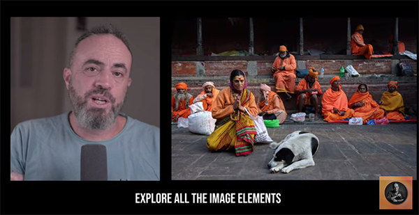
Excire encourages users to “not think too narrowly” when selecting their best shots to enter. Excire pointed out that eligible subjects include (but limited to) headshots, studio portraits, travel and environmental portraits, street candids, people-focused event photos, and wider scenes that feature people as a dominant element.

My Conclusion
Ambivalent about using AI to judge a photography contest? Not me. Remember the AI model was tutored by expert photographers, so the standards are consistent and blended. In many ways that’s inherently less biased than one individual making the decisions.
Unfortunately, I’m not eligible to enter. But I’ll bet it’s a thrill to receive a snap judgement the instant you upload a snap.
Join the Shutterbug Community!
Sign up for a free account. Subscribe to our newsletter (see sign-up form on our homepage) and bookmark Shutterbug as a Favorite on your browser so you can check back often. Visit our Gallery section and spend five minutes or less uploading your best shots once a week or so. You may even become a Shutterbug Photo of the Day photographer. In the Galleries you’ll see the amazing work of thousands of photographers from all over the world. Add your own images to our ever-growing collection. It’s a great way to connect with other photographers and share your knowledge and passion for photography.
—Jon Sienkiewicz


