10 Tips for Capturing Fantastic Spring Flower Photos (VIDEO)
Spring is finally here, although you might not realize it if you live where there’s still snow on the ground. In other parts of the country, however, the first flowers of the season are emerging and beginning to bloom. This means that it’s time to bone up on your floral photography skills.
Instructor Albert Dros is the perfect guy for today’s tutorial and he provides 10 pro tips and techniques in the next 10 minutes. He’s a passionate landscape photographer and educator based in the Netherlands where everyone takes their flowers seriously. So pay close attention and then head outdoors and start practicing today.
This is one of those accessible genres that doesn’t require you to travel far in your search for a suitable subject. Once flowers bloom they can be found at nearby parks, a local nature center, and even along the road or in your own backyard. And you can capture these colorful blossoms with just about any gear you own.

Dros discusses the importance of camera angles, perspective, and the vantage point from which you shoot. He puts it like this, “I’ve said it before and I’ll say it again: get down low and don’t shoot from eye level.” He explains that you won’t achieve effective subject separation by shooting from above. If your camera features a flip screen, this ground level perspective is super easy to employ.
Another tip involves taking advantage of the light by positioning yourself correctly relative to the sun so you can emphasize fine details on a flower’s petals, stem, and leaves. You’ll see how soft light, backlight, and sidelight all provide opportunities for interesting effects, so don’t hesitate to experiment when framing up a shot. The simple umbrella you use to keep dry on rainy days can also be a big help in blocking direct sunlight coming from above.
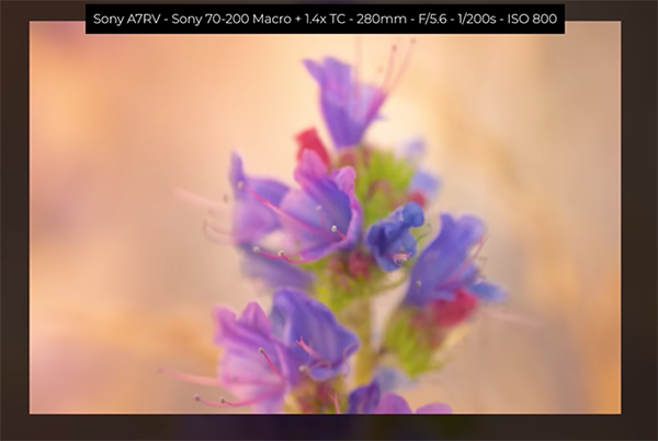
Dros also discusses his focal length preferences for this style of photography, and he provides a list of his favorite lenses in the description beneath the video. He explains that he often shoots flowers with a telephoto because a long lens enables him to control depth of field by moving further back to create a beautiful blurry background that accentuates the main subject.

At this point we’ve barely scratched the surface of everything you’ll learn for capturing beautiful flower photos that stand out from the crowd. So be sure to watch until the end and maybe jot down a few notes for future reference.
Then take a look at Dros popular YouTube channel that features a wide range of how-to videos for everyone who shoots in the great outdoors.
You may also want to watch a tutorial we featured with another experienced pro who demonstrates five of the most common mistakes made by inexperienced nature and wildlife photographers and how to avoid them.


