Crafting Impact with Negative Space Photography
Picture a scene where the main act is not just what fills the frame, but also what doesn’t. That’s negative space photography, a technique that turns emptiness into expression and silence into storytelling.
In this deep dive, we’re peeling back layers to reveal how much weight nothingness can hold in your shots.

You’ll grasp why every photographer needs to give their subjects some breathing room and learn how empty areas are not missed opportunities but rather essential for creating balance and drawing attention right where you want it.
We’ll explore ways to use plain backgrounds or blurred surroundings as powerful tools that add feelings of calm, tension, or intrigue—all by letting less say more.
The Essence of Negative Space in Photography
Negative space photography, often seen as the quiet hero of composition, plays a crucial role in how an image is perceived. It’s not just about what you capture—it’s also about what you leave out. This technique can make your main subject pop by simply giving it more breathing room.
Defining Negative Space and Its Role in Visual Composition
Negative space refers to the area surrounding the main subject—or positive space—of a photograph. But don’t let the term ‘negative’ fool you; this isn’t unwanted territory. In fact, negative spaces are integral to creating balanced compositions that draw attention right where you want it.
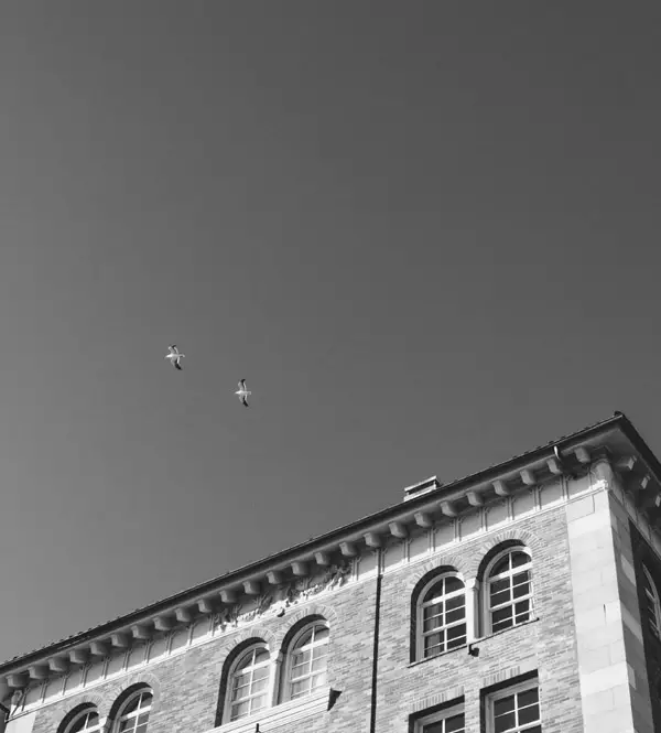
A common misconception is that negative space must be white or plain areas within an image; however, any large plain background or high contrast scene can serve as effective negative space. By paying careful attention to these elements, photographers have found they can add feelings of solitude or tranquility depending on how much empty space occupies the frame around their focus subject.

In event photography and street scenes alike, using negative spaces helps eliminate distractions so your subjects stand out even if they occupy only a tiny portion of your frame—a powerful way to tell stories through imagery without crowding viewers with too many details at once.
The Emotional Language of Negative Space
Negative space work does more than tidy up visual clutter; it speaks directly to our emotions. Photographers adept at leveraging this tool create images that convey emotion effortlessly because when we look at photographs with plenty of ‘breathing room,’ our minds fill those voids with context based on our own experiences and emotional responses.
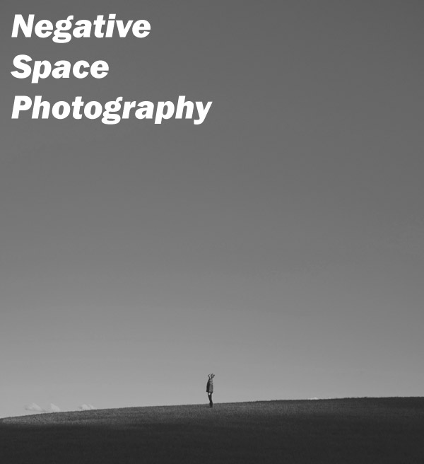
To add negative feelings like isolation into portrait photography shots doesn’t always mean needing props or dramatic lighting—sometimes all it takes is framing your shot such that there’s ample empty sky above someone sitting alone on a bench for instance: instantly adding depth both visually and emotionally without saying a word. It’s something learned best through practice and experimentation rather than textbook guidelines.
Mastering Composition with Negative Space
When you’re framing that perfect shot, what’s not there can be just as powerful as what is. In the dance of balancing positive and negative space in compositions, mastering negative space isn’t just about having less—it’s about using emptiness to make your subject shout without saying a word.
Crafting Balance Between Positive and Negative Spaces
In photography, balance is key. But it’s not always about symmetry; it’s also how well you play the game of give-and-take between filled and empty spaces. To create an image where viewers feel at ease, pay attention to how much real estate each type occupies. The trick? Let larger areas of negative space compared to positive spotlight your main attraction—your subject becomes more noticeable this way.
Negative spaces serve up breathing room for your main subject while eliminating distractions around them. It may seem counterintuitive, but sometimes making your subject smaller adds more weight to its presence within the frame—the classic ‘less is more’ scenario in action.

To get a grip on this concept think of portrait photography or even stock photos where often a face fills most of the frame—a tight crop creates intimacy yes, but flip that script by introducing large plain areas surrounding our hero (that’s right: I’m calling faces heroes now), suddenly there’s drama because we’ve added feelings like solitude or contemplation into the mix.
Utilizing Leading Lines to Enhance Focus
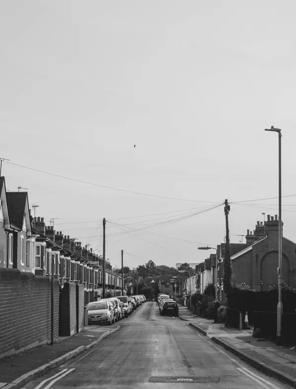
We’ve all been down paths both literal and metaphorical—but have you used them in your shots? Incorporating leading lines does wonders for weaving through cluttered street scenes straight toward your focal point thanks largely due again…to none other than good ol’ negative space. They’re excellent tools for gently guiding viewer’s eyes across an image without screaming “Look here.” Instead they whisper sweet visual nothings drawing us deeper into pictures naturally creating a sense of journey even if we’re only moving from one side of an image to another.

This technique shines especially bright when shooting event photography or any bustling scene really—where else would those chaotic backgrounds benefit so greatly from some blurred background courtesy via shallow depth field eh?
If these strategies sound enticing yet slightly intimidating don’t worry—with time examining different types images focusing specifically on their spatial composition patterns will emerge showing you precisely when add-negative-space makes sense given particular context whether abstract dynamic minimalist serene etcetera…you name it.
Balancing Acts: When Less Becomes More
Remember, creating balance in your photos isn’t about having equal space. It’s about the harmony between filled and empty areas that makes the shot work.
Creative Approaches to Negative Space Photography
When you think of negative space photography, it might conjure images of vast, empty skies or minimalistic compositions that feel almost meditative. But let’s twist the lens cap off and explore how we can get a bit unconventional with our spaces. This isn’t just about having more white on your canvas; it’s about experimenting with abstract forms and dynamic effects that grab attention.
Defining Negative Space and Its Role in Visual Composition
Negative space is like the silent music between notes—it defines everything else around it. In visual arts, including photography, this concept plays a critical role by framing the main subject (positive space) in such a way that they both complement each other. Think of it as giving your subjects room to breathe within the frame while eliminating distractions for viewers’ eyes.

Incorporating negative space doesn’t mean you must have only large plain areas or high contrast scenarios; sometimes, even subtle spacing can lead to impactful results. As photographers weave this element into their work, they create images where balance positive interactions emerge naturally without feeling forced—a true sign of mastery over composition techniques.
The Emotional Language of Negative Space
A picture speaks not only through its colors and shapes but also through what is left unsaid—the voids which add feelings or convey emotion effectively without being overtly dramatic. By understanding how negative space can convey emotion subtly yet powerfully, photographers unlock new ways to express themes like isolation or tranquility simply through spacing choices around their focal points.
This approach often relies less on following set rules than trusting one’s instincts honed from time examining countless frames—learning when an area surrounding needs just a tiny portion more breathing room could make all difference in delivering balanced composition filled with intended meaning.
Mastering Composition with Negative Space
To master composing shots where negative spaces are at play requires practice but starts fundamentally by paying close attention during shoots—spotting potential leading lines perhaps provided by urban architecture or natural contours which draw attention towards focus subjects effortlessly while maintaining interest throughout the entire scene.
Crafting these compelling narratives means always looking out for opportunities—not just settling because something looks ‘good enough.’ If incorporating leading lines enhances focus then go ahead and take advantage of it, find angles and positions wherein these elements come together harmoniously alongside chosen subjects. This pursuit of the perfect harmony in a photograph, seen through the eyes of beholders everywhere, inspires awe and marvel at the sheer brilliance captured within each frame.
FAQs
What is an example of a negative space?
In a photo, it’s the area around and between subjects. Think clear sky surrounding a lone tree.
What is a negative space shot?
A shot where background emptiness draws your eye to the main subject, like solitary silhouettes against dusk.
What is the difference between negative space and minimalism?
Negative space focuses on unused areas; minimalism strips down elements. Both value simplicity but apply it differently.
Why should negative space be used in landscape photography?
It brings out vastness and scale, letting nature’s beauty breathe and impress without cluttering views.
Conclusion
Embrace the art of less. Negative space photography transforms your images, turning emptiness into a canvas of emotion and story. Remember this: balance is key. The dance between negative and positive spaces defines your subject, guiding eyes with purpose.
And keep experimenting. Whether abstract or minimalistic, it’s about creating impact with fewer elements but more intention. Negative space isn’t just absence; it’s an active character in your visual tale. Use it to craft scenes that linger in memory long after one glance. In essence, give room for imagination to roam—because sometimes what you don’t capture says the most. Click the following link to learn how negative space can have a positive effect.


