Do You REALLY Know the Basics of Color Theory? 2 Ways to Improve Your Photos (VIDEO)
Everyone who is serious about photography needs a basic familiarity with color theory if they want to shoot and edit images with maximum impact. This tutorial will get you up to speed in barely five minutes and help you use this essential information in two very important ways.
Instructor Mike Rogala is a professional landscape photographer and image-editing expert and he puts it like this: “Understanding color theory is not just about enhancing the esthetic appeal of your images, because this knowledge is also essential for conveying emotions and becoming a more skilled visual storyteller.”
The concepts are essential for all types of artists, but Rogala limits this discussion to color theory in conjunction with the quality of prevailing light and it pertains specifically to the craft of photography. It all has to do with how your eyes and the sensor in your camera perceive light waves of different lengths—with every color responds in a unique way

Rogala also provides a quick overview of how Hue, Saturation, and Luminance factor into the equation when it comes to capturing and adjusting the various tones in an image—”three fundamental aspects of color that every photographer should know.” He explains that Hue refers to the color itself, while Saturation is a measure of color intensity, and Luminance (or brightness) defines “the amount of light emitted or reflected by a color.”
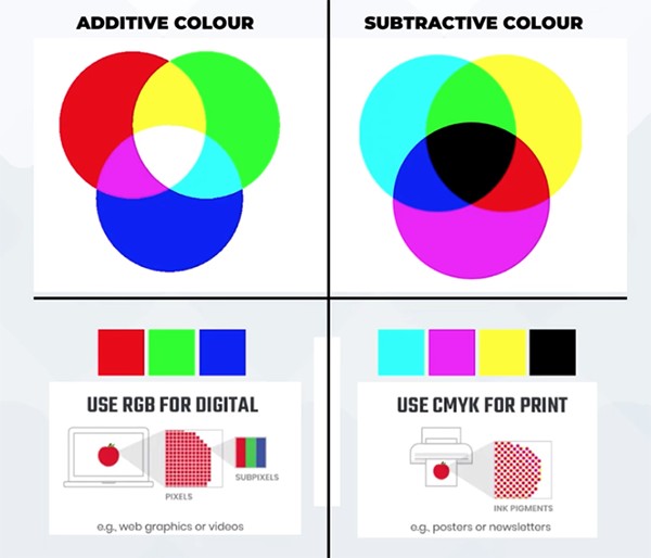
A solid understanding of the three aforementioned criteria is crucial for optimizing the tone and the depth of just about any image you shoot. Rogala explores the ramifications with graphics to help you understand how all this contributes to well-balanced images. He also clarifies the difference between the RGB color model for digital photography and how the CMYK model works for print.
You’ll also learn why Rogala says it’s important to calibrate your computer monitor at least every six months. Equally key, according to Rogala, is the periodic calibration of your printer, if you output images at home. Just spend some time with the instruction manual because most photo printers have a built-in calibration tool.

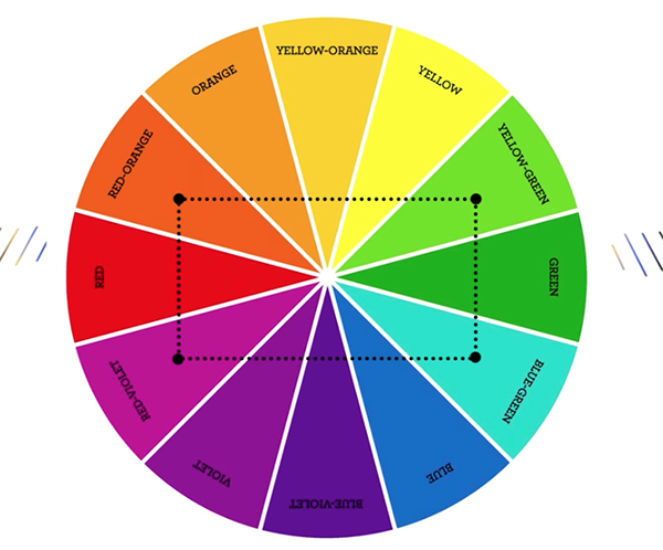
Another helpful tool for getting the job done is the ubiquitous color wheel for photographers, and Rogala explains how to use this tool to identify colors that are complimentary, noting that these appear opposite of one another when viewing a color wheel. You’ll learn how easy it is to create photos “with high contrast and vibrant effects” when composing a scene with complimentary colors in mind.
There are several other great tips and more details in the video, so be sure to watch until the end. Then check out Rogala’s instructional YouTube channel where you’ll find more information that will help you elevate your skills.
And on a related note, don’t miss the tutorial we posted recently from another expert who explains how to use Lightroom’s color-grading tools to create stunning landscape photographs with whatever mood you intend to convey.


