L-shaped kitchen ideas to make your space work harder

Choosing the right layout is key to making your kitchen space work and to make it somewhere you enjoy spending time. L-shaped kitchen ideas are a traditional layout style – and for good reason. This shape offers plenty of flexibility and storage, without the space feeling too enclosed.
L-shaped kitchen layouts also free you up from one of the biggest worries. It’s not enough to simply have a stylish looking space – If a kitchen fails in terms of practicality, it’s just annoying to work in and not an easily, or cheap, mistake to fix. ‘L-shaped layouts are one of the most practical and versatile options you can go with,’ says Al Bruce, Founder of Olive & Barr. ‘It is perfectly designed with practicality and flexibility at the forefront and the style allows for space-saving storage solutions and the use of every corner of the kitchen.’
Whether the space is generous or small, an L-shaped layout works with both contemporary and traditional cabinetry. And the form is flexible enough to adapt to structural needs, such as sloping ceilings or large windows.
L-shaped kitchen ideas
Once you’ve settled on how to plan a kitchen layout in your space, you can choose one of these L-shaped kitchen ideas to design a pretty and practical room. After all, Even though your choices are dictated by the shape and size of your room to a large extent, that doesn’t mean you have to be restricted when it comes to design.
1. Play with colour blocking

Image credit: Daval
‘An L-shaped solution will help you make good use of the space available and you’ll have plenty of room for cabinets on one side, as well as ample space for bar style meals on the other,’ says Simon Bodsworth, MD, Daval Furniture. ‘The cook has plenty of room to manoeuvre and can chat with guests at the same time, it’s a real win-win in a hardworking kitchen that likes to entertain guests.’
As well as being perfectly practical, an L-shaped kitchen with an island provides a wonderful base to start working with colours. Choose two complementary colours for the cabinetry and island, and use surfaces in one of these two shades. For an added pop of colour, select a third – more unexpected – tone, and use in accessories and detailing, like window dressings, upholstery and tiling.
2. Break up the layout

Image credit: Second Nature Kitchens
‘Think about the size of the room you have and what you want to do in that room,’ says Graeme Smith, head of design at Second Nature Kitchens. ‘Is it purely cooking? Or do you want to use it for socialising, dining or working too?’ If the latter, adapt your L-shaped kitchen idea to suit your needs.
For a kitchen which will be multifunctional, tuck a second of the ‘L’ behind a panel of glazing to create some privacy. This is great for keeping mess hidden from guests, and for prepping food in if other family members are working elsewhere in the space.
3. Fake a U-shape layout

Image credit: Wren Kitchens
A sister layout to L-shaped, U-shaped kitchen ideas simply add another working ‘arm’ to the space. It’s another practical and pleasing layout, and you can cheat one in your kitchen without redoing cabinetry.
Choose two benches or an L-shaped sofa, and place directly next to the end of your cabinetry. For a seamless look that will trick the eye, match the upholstery to the colour of your cabinets.
4. Link with materials

Image credit: Harvey Jones
L-shaped kitchens with islands are always a good look – so long as you have enough space for people passing each side of the island. The downside is that the two work areas can seem rather disparate.
Link the sections together by matching your materials exactly. Think the same surface material, the same cabinetry paint and the same hardware. Not only will this create a cohesive look, but the space will look larger as your eye isn’t drawn to something ‘different’ elsewhere in the room.
5. Balance your storage

Image credit: Optiplan Kitchens
‘Maximise the use of worktops and cabinets down the room – including storage low and high to make the most of storage space available,’ says Andy Briggs, Interior Designer at Optiplan Kitchens. ‘ A large number of cupboards and some internal storage solutions can all push up the price of a new kitchen – so think about what kitchen layout will best suit your lifestyle and what you want to achieve in this space.’
Make the room feel larger without compromising on this key storage element by painting higher cabinets in the same colour as the walls, so they seem to disappear. Lower cabinetry should then be in a lighter, brighter shade to draw the eye without weighing the room down.
6. Create a practical workspace

Image credit: Olive & Barr
As with every kitchen layout, it’s key to consider the working triangle. This is the space in which most of the practical work is being done – the chopping, cooking, cleaning and so on. The idea is that you want everything to hand so that work flows in an easy and unencumbered manner.
L-shaped kitchens provide a great basis for creating a practical working triangle. A good idea is to start at the far end of the ‘L’ and work along the two arms in the order in which you will be accomplishing tasks. Perhaps starting with your sink for washing food, surfaces for prepping, and then onto the oven for cooking.
7. Store vertically

Image credit: Future PLC/Veronica Rodriquez
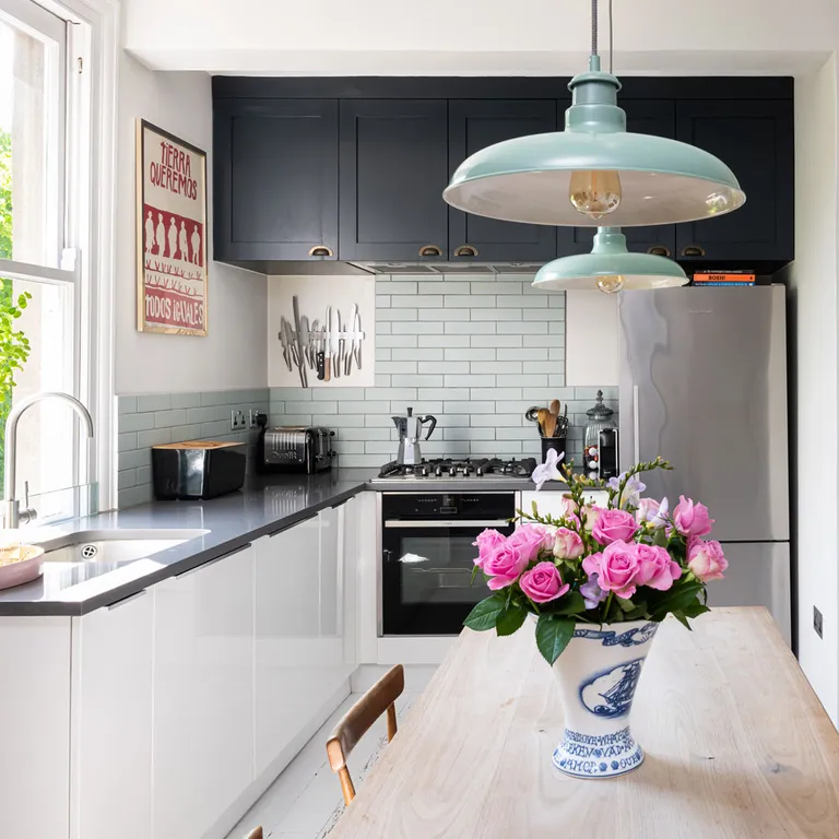
L-shaped kitchens are efficient at making the best use of space. Take the design ethos one step further by using the entire wall to fashion clever storage solutions, from floor to ceiling.
Working with the dominant wall, the one without a window in this case, stylish kitchen cabinets are used above a tiled splashback.
The statement storage spans the entire width of the wall and reaches to the ceiling to ensure every inch of space is utilised. Making the most of storage space is an important thing to do in galley kitchens, too. To add another smart vertical storage element, the chefs knives are stored along a wall-mounted magnetic strip.
8. Balance the L-shape with a window

Image credit: Future PLC/Barbara Bazso
This is the most practical way to use an L-shape, and the most popular. By running one side of the L under a window you help to balance the other side, which houses the cooker, cooker hood and cabinets.
By incorporating the window into the design you help to give equal purpose to the far wall, using the view beyond to make a statement. Windows also help to lighten U-shaped kitchens as well. Take the look further by adding a patterned blind to add interest. In this homely white kitchen the generous window needs little else to grab attention.
9. Double the L-shape potential

Image credit: Future PLC/Robert Sanderson
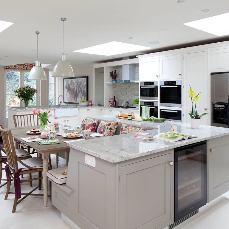
If space is no issue you could opt for a layout that cleverly incorporates two L shapes. A bit like the premise of a classic video game, use the kitchen units to fit together perfectly to make the best use of floor space.
The main L-shaped counter can be a base for the kitchen appliances and amenities, while a smaller L fits within the space to house a built-in dining bench area. Using the L shape to fashion a separate zone helps to create a sociable dining area that feels disconnected just enough from the main cooking space.
10. Embrace an L shape for an open-plan layout

Image credit: Future PLC/Robert Sanderson
It goes without saying, if you have an open-plan kitchen and living area, you only really have two walls on which to consider for the kitchen.
Capitalise on a far-side corner to keep the kitchen restricted, allowing the living area to benefit from the windows and other architectural details.
The kitchen takes up valuable wall space which means you therefore can’t sacrifice any walls with design details already in place. When considering kitchen appliance layout ideas, keep sinks and appliances to one end to ensure they are at the furthest distance from the living area also.
11. Make the most of a small kitchen space

Image credit: Future PLC/Lizzie Orme
In a small kitchen an L shape is ideal as it concentrates all storage and appliances into two sides of the room, leaving the others free and open. This makes the overall space seem bigger.
Keep the colours on the lighter side so it doesn’t appear too cramped. A mixture of cabinets and drawers makes housing pans, pots and general paraphernalia a breeze. While glass Kilner jars display pretty condiments and dried food to perfection.
12. Open up your scheme

Image credit: Future PLC/David Giles
This L-shaped kitchen makes excellent use of space. It is easy to work in, as the work triangle can be easily established. Open shelving prevents a small kitchen from looking too busy, while banks of cabinets look stunning in a large kitchen as well as providing an abundance of storage.
A table and chairs fits neatly into the kitchen, while still zoning it off from the rest of the room. Whatever the size of your kitchen, the beauty of the L-shaped layout lies in its simplicity and flexibility. And the ease with which it can be adapted to suit practical requirements and different design tastes, too.
13. Utilise colour and pattern

Image credit: Future PLC/Lizzie Orme
Don’t be afraid to use darker colours and patterns in your kitchen. Deep colours are warming so often work well in larger kitchens. Inject refined rustic style with painted wooden cabinetry.
In a traditional space, use painted wood to co-ordinate kitchen cabinets with walls and architectural features; in a contemporary scheme, to soften the sharp edges of minimalist design. Go for a mid to deep shade, like the one in this grey kitchen, as it oozes easy elegance and sophistication.
14. Incorporate an island

Image credit: Fiona Walker-Arnott
Where space isn’t an issue an L-shape with a central island unit provides informal dining space for the family or a place to chat with friends over coffee. Keep the cooking and kitchen chores tightly together in an L and let the rest of a large room be given over to family life.
Add personality and character with quirky signage and curios, which pop when set against cream kitchen ideas like in this scheme.
15. Consider cabinetry

Image credit: Future PLC/Lizzie Orme
Lack of size does not have to mean lack of style. This compact L-shape kitchen with high-gloss units creates wow factor in a small space with its sleek stainless steel appliances and an acrylic splashback in bright pink.
This smart kitchen splashback is a perfect example of how kitchen planning and interior design have become intertwined. A simple Corian worktop complements the look.
16. Keep the kitchen family friendly

Image credit: Future PLC/Colin Poole
Make your kitchen work perfectly for busy family life. Fitting your cabinetry, worktops and storage into an L shape leaves the remainder of your kitchen free to move around the space.
Here, maximising the space on two sides of the room allows for an uncluttered look opposite, creating a spacious feel. The look of a layout has become a major factor in an open plan scheme. Think more carefully about the design and aesthetic of the kitchen as it will always be on view.
17. Work storage into a corner

Image credit: Future PLC/Lizzie Orme
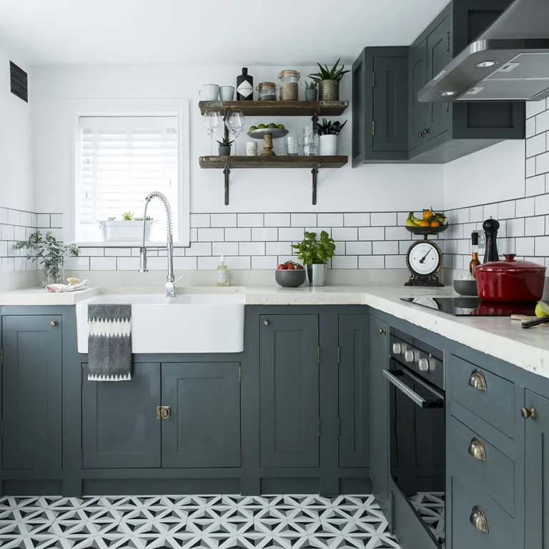
Give a wood-effect design an edge with statement accessories. This rustic country kitchen is brought to life with contemporary tiling. The choice of light and dark tiles, which work to separate the cooking and prep zones, provides a stark, modern contrast to the more traditional cabinet design.
If your kitchen is verging on the small side, consider installing wall-hung shelves into the corner of the room.
Open shelves are a practical and stylish solution in any kitchen. Display china and glassware, so that they are easily accessible. Try running a fixed rail below the bottom shelf to hold utensils with hooks for saucepans.
How do you arrange an L-shaped kitchen?
The ergonomics of kitchen layouts focus on creating a smooth, intuitive passage through the space, as well as the most efficient and comfortable cooking environment. Worktops and cabinets are positioned to effortlessly suit the physicality of the user and the job in hand, with sinks and appliances located to encourage logical movement between tasks. Smart kitchen storage ideas ensure provisions and utensils are stored where they’re most frequently used.
What is an L-shaped kitchen with an island?
‘For those working with an open-plan space, this style of kitchen works exceptionally well,’ explains Paul Bangs, category director for kitchens at Wickes. ‘The addition of an island can provide an extra preparation and seating area, whilst becoming a focal point for the room. Likewise, this style of kitchen works well for those who entertain often or have families, as they offer plenty of space.’
‘The island kitchen creates a centerpiece in the kitchen, allowing you to utilise your kitchen as both a workspace and social area where friends and family gravitate throughout the day,’ adds Olive & Barr’s Al Bruce. ‘The setup is ideal for gathering the family and the added worksurface allows multiple members of the family to get stuck in and help at dinner time.’
Where should a fridge be in an L-shaped kitchen
With any kitchen design the placement of the fridge has to inline with the design triangle of use – the journey between fridge, sink and oven. But given the shape of an L this will mean the fridge is best placed at either end of the workstations, because it’s the starting point of the journey. If you have a freestanding fridge, the best place for it is at the very end of the L shape, so it doesn’t interrupt the flow of workspace. If the fridge is integrated below countertop level there’s more freedom for placing it closer to the sink.
The post L-shaped kitchen ideas to make your space work harder appeared first on Ideal Home.


