Travel Guide to Dunfermline, Fife, Scotland
In the heart of Fife, Dunfermline was once Scotland’s ancient capital, where King Robert the Bruce was buried and, in the 19th century, the birthplace of industrialist and philanthropist Andrew Carnegie. Whether you’re a history buff, a nature enthusiast, or simply looking for a peaceful getaway, the city is well worth a visit.
Dunfermline isn’t just about the past—it’s a thriving modern city with plenty to offer. Main Street, bookended by two large patches of green, is dotted with shops, cafes, and restaurants. It’s dominated by the City Chambers, a 19th century French Gothic creation, with an elaborate four face clock tower.

Forth Bridge
Dunfermline’s central location makes it an excellent base for exploring the rest of Fife and beyond. The iconic Forth Bridge, a UNESCO World Heritage Site, is just a short drive away and offers stunning views of the surrounding area. For beach lovers, the charming coastal villages of the East Neuk of Fife are within easy reach
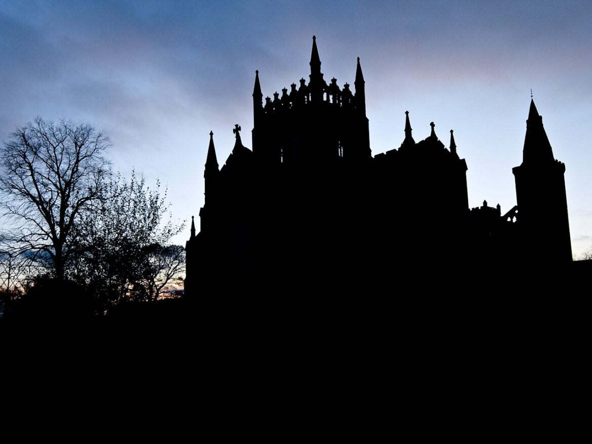
Dunfermline Abbey
The Abbey is most famously the burial site of Robert the Bruce, Scotland’s iconic warrior king, whose leadership secured the country’s independence during the Wars of Scottish Independence. His grave, marked with a striking brass inlay within the abbey church, draws visitors from around the world.
It’s also the final resting place of numerous Scottish monarchs, including Queen Margaret (later Saint Margaret), who was canonized in 1250 for her piety and a place she is charitable works. Her legacy endures in the nearby St. Margaret’s Cave, said to have used for private prayer. There are also the remains of the earlier Benedictine abbey that she founded with her husband King Malcolm III, in the 11th century.
The newer 12th century Abbey boasts a Romanesque nave, with bold chevron-patterned columns, showing clear Norman influence. After the dissolution of the monasteries, the choir was allowed to collapse but, in the 19th century, the Church of Scotland incorporated the ruins into the modern parish church.
Andrew Carnegie
Dunfermline’s claim to fame extends beyond royalty, it’s also the birthplace of Andrew Carnegie, the industrialist and philanthropist who became one of the world’s wealthiest men. He was born here in 1835 before leaving for America to make his fortune.

Andrew Carnegie Statue
In the restored 19th century cottage, where he was born, the Andrew Carnegie Birthplace Museum take you through his humble beginnings to his time in the USA. There he revolutionized the steel industry and later dedicated his wealth to philanthropic endeavours. Adjacent to the cottage is the beautiful Art Deco museum hall, built by his widow in 1928.
Pittencrieff Park

Pittencrieff Park
Known locally as “The Glen,” Pittencrieff Park is one of Carnegie’s most generous gifts to his hometown. Spanning 76 acres, the park is a green haven in the heart of the city and, as you’d expect there’s a giant statue of the man himself. Peacocks roam freely through its landscaped gardens and ancient woodlands. The Glen Pavilion is a lovely Art Deco style building that is a popular venue for weddings.
Dunfermline Carnegie Library and Galleries
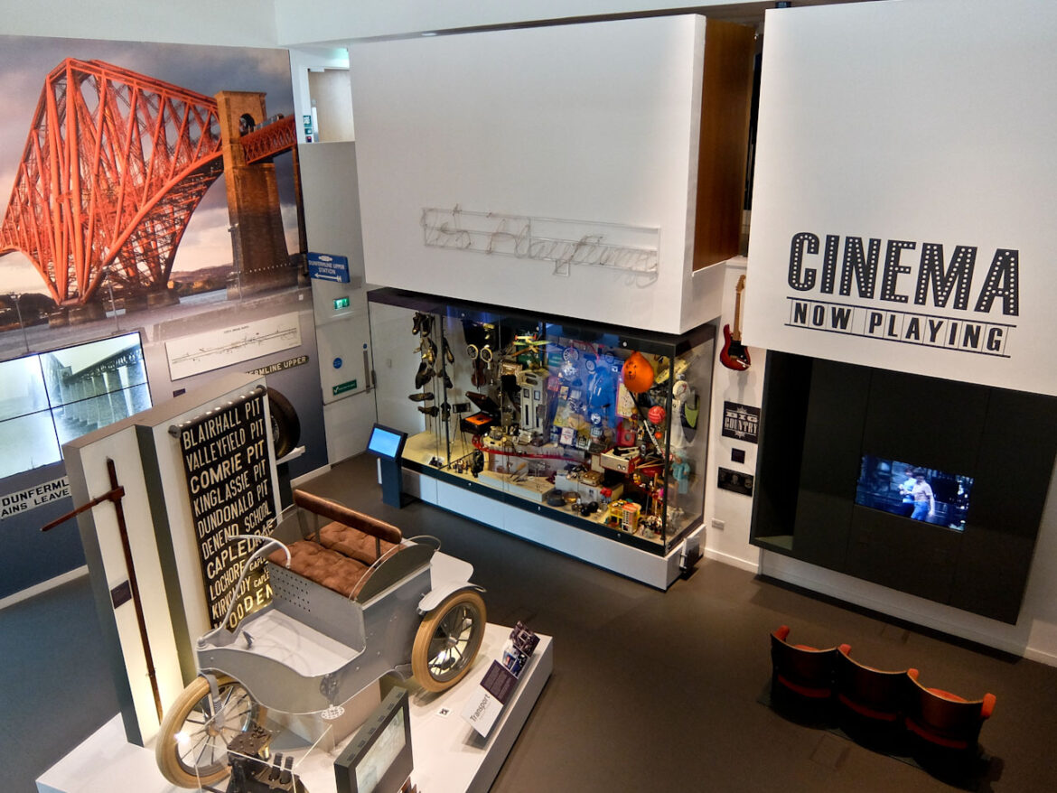
Opened in 2017, Dunfermline Carnegie Library and Galleries (DCL&G) is set in the heart of the town, seamlessly combining a contemporary design with the heritage of Scotland’s first Carnegie Library. This was gifted by Carnegie in 1883, the first of 2800 libraries funded by him worldwide.
The museum details the rich history and culture of Dunfermline from its medieval beginnings to its industrial achievements. There’s a cinema and café and the art galleries have rotating exhibitions featuring local and international works. A stunning glass-walled terrace provides panoramic views of Dunfermline Abbey and the city’s historic skyline.
Culross
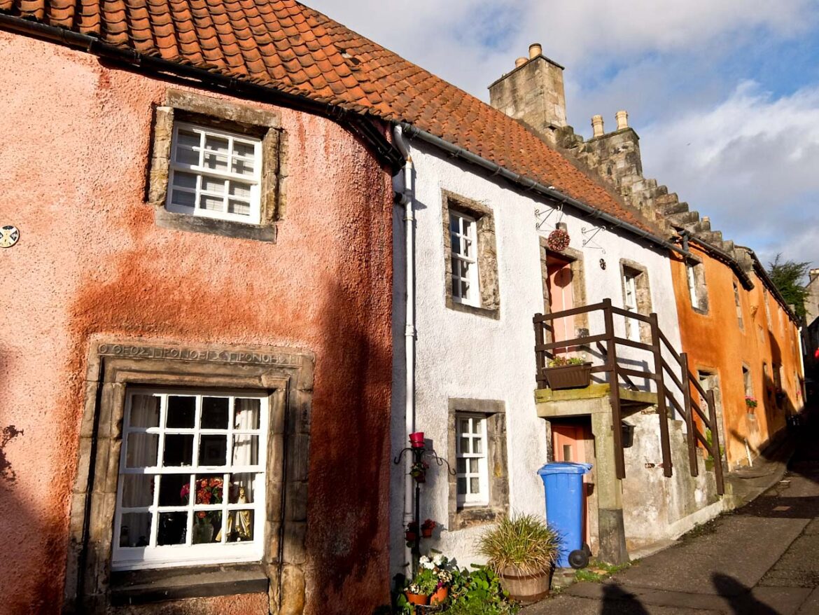
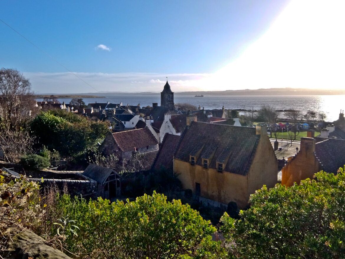
On the north shore of the Firth of Forth, the village of Culross (pronounced “Coo-riss”) is one of Scotland’s most well-preserved historic villages. Established in the 6th century, it blossomed in the 16th and 17th centuries as a prosperous trading port, thanks to its thriving coal and salt industries. However, as time moved forward, Culross seemed to resist the march of progress.
Today, it serves as a living museum of Scotland’s past, its cobbled streets, white washed houses with red-tiled roofs, and vibrant gardens providing an authentic glimpse into what life might have looked like centuries ago.
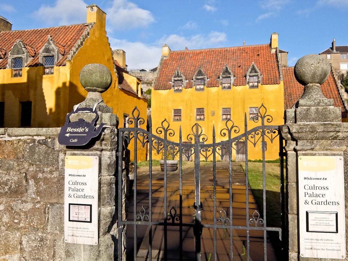
Culross Palace is a beautifully restored 16th-century merchant’s house that dominates the heart of the village. Built between 1597 and 1611 by Sir George Bruce, a wealthy coal and salt magnate, the palace is a richly detailed representation of Renaissance domestic architecture in Scotland. It’s immediately recognisable with its mustard-yellow lime wash and distinctive crow-stepped gables.
Inside, the interiors have been painstakingly restored to reflect their historical glory, complete with painted woodwork, intricate plaster ceilings, and period furniture. The palace gardens are another highlight, meticulously designed to resemble those of the 17th century. Wander through the terraced gardens, filled with fragrant herbs, colourful flowers, and heirloom vegetables.
East Neuk of Fife
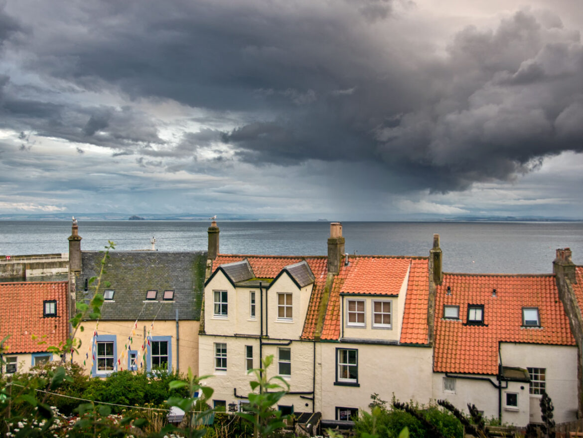
Hugging the rugged coastline of eastern Scotland, the East Neuk of Fife boasts a series of picture postcard fishing villages, each with its own unique character. St Monans, with its weathered pier and historic windmill, invites exploration, while Pittenweem has a working harbour which enchants with its whitewashed cottages, all red pantile roofs and crow-step gables
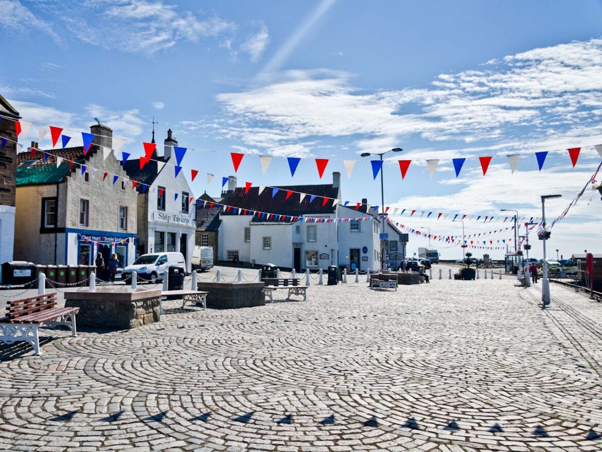
Wander through the cobbled streets of Anstruther, known for its award-winning fish and chips, and discover the maritime heritage at the Scottish Fisheries Museum. You can also take the ferry for a trip to the Isle of May, now a national nature reserve.
Crail, perhaps the most photographed village, has the Crail Museum and Heritage Centre detailing tales of smuggling and seafaring. Charming cobbled streets tumble down to the miniature harbour, which is sheltered by cliffs and framed by colourful fishing boats. The Fife Coastal Path, stretching 117 miles, is a good way to explore East Neuk.
Kingsbarns Distillery
Situated on the outskirts of the village of Kingsbarns, the distillery is famous for its Lowland single malts and Darnley’s Gin. A guided tour takes you through the garden where they grow the botanicals and then to the Gin Cottage. This houses the 350l copper pot still where their London Dry style gin is produced. A guided tasting follows, with a selection of nibbles.
Factfile
GO: LNER goes from Kings Cross to Dunfermline in around five hours. There are also regular bus transfers from Edinburgh airport.
INFO: Welcome to Fife has information about the region.
STAY: Garvock House Hotel is a short walk from Dunfermline centre and offers luxury family owned accommodation with good food.
EAT: Jack ‘O’ Bryan’s is good for fine dining in Dunfermline.
The Haberdashery Bistro has excellent local specialities in Dunfermline.
The Wee Chippie in Anstruther has some of the best fish and chips I’ve ever tasted.
The Red Lion in Culross has excellent pub food and good beer.
The post Travel Guide to Dunfermline, Fife, Scotland appeared first on The Travel Magazine.


