Dramatic Dark Tones Give Outdoor Photos More Spice: Here’s How (VIDEO)
It’s super easy to add drama and visual interest to wildlife and nature photos by emphasizing dark tones in Lightroom. This tutorial from Park Cameras, a leading retailer in the UK, explains a simple post-processing technique that accentuates colors, separates the subject from surrounding areas, boost contrast, and much more.
Gareth Evans is an adept photographer and image-editing specialist whose enthusiastic videos are among the most popular that we post. In today’s episode he uses a somewhat flat photo of a robin perched on a limb to demonstrate how combining Lightroom’s HSL sliders with simple masks, create a super-impactful look.
This dynamic method works great for wildlife shots and outdoor scenes with subjects that need a bit more punch. Evans plays around with selective exposure adjustments, Contrast, light, Saturation, and other key variables to complete his attention-grabbing transformation.
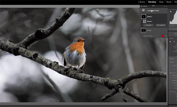
After cropping the image for a tighter composition, Evans makes a few global adjustments that include pumping up Contrast, darkening Shadows, and decreasing Highlights. He also introduces Clarity, Texture, and Vibrance.
Now it’s time to work on the colors and Evans does that in Lightroom’s HSL panel to modify Hue, Saturation, and Luminance with simple sliders. He first adjusts Hue to move orange tones closer to red. By desaturating greens and yellows in the background the image already has a much richer appearance.
Evans then turns to Luminance and darkens the shot further by dropping yellow and greens. This creates a moody look that Evans accentuates by dropping the blacks. The trick is making the aforementioned enhancements without biasing the robin, and this task begins with two simple masks and a brush to darken the eft side of the bird while brightening it’s head and tones on the right (in the direction of the light).
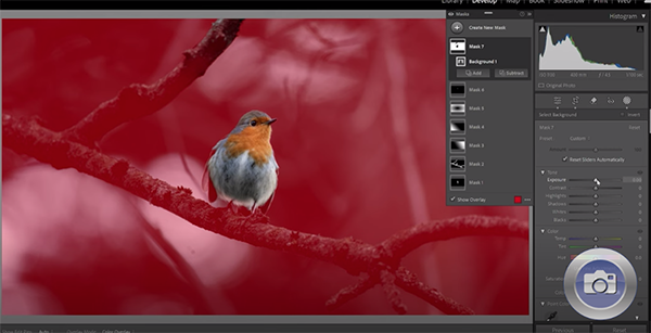
At this point many of us would be very satisfied and consider the job done, but Evans is a perfectionist with a few more tricks up his sleeve. Watch how he completes the job, compare the before/after photos, and you’ll be duly impressed.
There are many more shooting and processing tips on the Park Cameras instructional YouTube channel, so be sure to take a look.
And then check out an earlier tutorial we featured with another image-editing expert who demonstrates how to give wildlife and landscape photographs a striking polarized effect when you didn’t shoot with a filter.


