The Western Digital My Passport Ultra external hard drive is exceptionally compact and offered in five capacities up to 6TB. Prices start at $69 and performance is superb. Everyone needs more hard drive space; here’s yours.
Overview
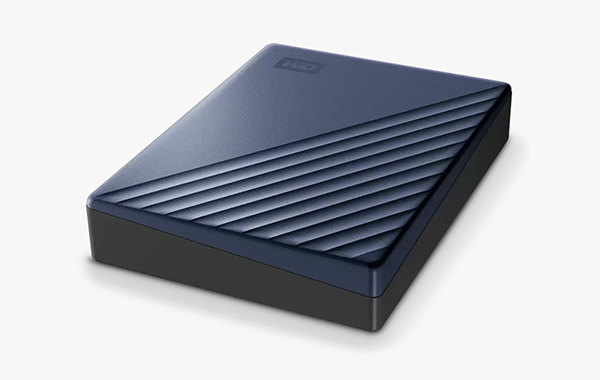
Western Digital, parent company of SanDisk since 2016 and legendary manufacturer of digital storage devices, offers the very compact (4.33 x 3.21 x 0.87 inches, 110.0 x 81.6 x 22.2 mm) WD My Passport Ultra, an external hard drive that weighs about 8 ounces and includes device backup software and optional password protection.

Key Features
Metal and 50% recycled plastic construction
USB-C interface, includes USB-C to USB-A adapter
USB 3.2. Gen 1 / USB 3.0 (USB 2.0 backwards compatible)
Windows 10+ (requires simple reformat for use with macOS 11+)
Includes Acronis True Image backup software
Offers protection against ransomware threats
Optional password protection, hardware encryption
Apple Time Machine compatible
Capacities up to 6TB
3-year Limited Warranty

Reasons to Buy Today
The Western Digital My Passport Ultra requires minimal diskspace and is perfectly sized for portable field and studio use. It’s cosmetically attractive and performed reliably in our tests. It’s USB-C ready and includes an adapter for older machines with only USB-A ports. It’s bus powered, so no external AC adapter is necessary. Plus you can invoke password protection to make files unavailable to unauthorized users.
The extremely compact size and light weight make it ideal for on-the-go data storage and the pricing is very affordable. Fast USB-3.X data handling protocol assures quick read and write times. Plug and play operation. Requires simple reformat for use on Mac (this is completely normal).
Reasons to Shy Away
Because your internal hard drive will never crash, right? So play it fast and loose.
It’s too small; it could get lost under all that clutter at your workstation, he said sarcastically.
Sum & Substance
This is a no-brainer. Although the external hard drive market is crowded and abnormally competitive, the Western Digital My Passport Ultra offers a tremendous combination of compact size, high capacities, USB-3.X speed and attractive prices (e.g., the 5TB model costs just $139 when purchased from WD).
Price & Availability
Available in 1TB, 2TB, 4TB, 5TB and 6TB capacities with prices starting at $69.99. The 6TB version currently costs $199. Order directly from Western Digital or buy now from Amazon.
—Jon Sienkiewicz
(As an Amazon Associate, Shutterbug earns from qualifying purchases linked in this story.)