The living room speaks volumes about an individual, as it’s the space where we spend the majority of our leisure time and thus, mirrors our genuine tastes. Consequently, individuals often invest substantial efforts to create interiors befitting their personality. It’s particularly appealing if you find yourself attracted to a living room inspired by Mid-Century Modern design.
But simply because something is minimalist doesn’t mean it conforms to the aesthetic trends inherent in the classic styles; let’s face it, the last thing you want is for one of your guests to comment on the mid-century modern decor, and you don’t understand the origins of a mid-century modern living.
If you’re thinking about adopting a Mid-Century Modern-inspired living room for your home, but you don’t know where to start, you’ve come to the right place. In this article, we’ll explore the origins of the style and the various trends that have developed over time; we’ll also give you tips on how to adapt your home to this timeless style.
Why Is Mid-Century Modern Style So Great For Living Rooms?
Mid-century modern living room style is defined by smooth surfaces, sleek lines, and a minimalist approach; it also uses high-quality teak furnishings that are made to last. Mid-century modern living room style had its heyday in the 40s and 50s, but it is yet to go out of style and is still appreciated.
Since the peak of this popular style, mid-century modernism gained commercial success with Scandinavian culture embracing its unique minimalism. Everyone has heard of IKEA, the apex of commercialized mid-century modernism that looks authentic and remains amazingly practical.
But there’s another reason why mid-century modernism endures – the “make it new” mentality of the modernist movement’s high point means that this style is always relevant, always interesting, and always unique – the style is so great for a mid-century living room as it can be effortlessly adapted.
Key Elements Of A Mid-Century Modern Inspired Lounge
Mid-century furniture styles are indeed creative and flexible, but that doesn’t mean that anything goes. On the contrary, to make this style work, you need to have some idea of the tradition and a vision for how to make it work.
Below is your starting point; pick one of these styles, and dig a little deeper.
Functional teak furniture
One hallmark of modernist furnishings is the sleek, smooth wooden finishes popular in the 40s, 50s, and 60s – and what better wood to use than teak for a quality finish that stands the test of time. Teak is a particularly resilient wood with excellent durability and water -resistance; it also looks very elegant.
You will probably find teak furnishings in a mid-century modern living room; that’s because it is smooth, linear, and durable. Teak furniture had its heyday in the mid-twentieth century, but it’s still popular today due to legacy furniture that survives – find it in thrift stores and online.
Accents of bold color
Mid-century modern interior decoration has a lot in common with minimalism; you might even say the latter grew out of the former. Both design styles benefit from neutral colors that have changed over the decades. In the 50s, warmer neutral tones were popular; these changed to earthier tones in the 60s.
Overall, a mid-century modern living room looks for bold accent colors that juxtapose, just like the classic Mondrian style of the early 20th Century. This style, rooted in abstract art, has been adapted for interiors ever since. Create your own modernist utopia at home with artfully mismatched pieces.
A blend of mid-century and modern pieces
Juxtaposition is a characteristic of mid-century modern styles, and you will find a mid-century modern living room that makes use of mismatched colors and forms. However, the juxtaposition extends beyond the immediate styles of the room; they may also juxtapose time periods.
The modernist movement early in the 20th Century was defined by the poet Ezra Pound, whose statement “make it new” became an underlying philosophy of the movement. Not much has changed. Interiors can remain fun and relevant by integrating mid-century styles and modern furniture.
Sleek lines
Modernism and the mid-century modern living room were a reaction to the elaboration of the Romantic period. The modernists still took inspiration from nature, but they pared everything down and drew attention to the function rather than the form. That said, there were still organic lines.
Sleek lines and geometric shapes were a trait of the modernist movements of the early 20th Century. With regards to furniture, you will find coffee tables and chairs with tapering legs and circular forms; these pieces are often smooth and minimal, drawing attention to function without overembellishment.
Simplicity
Simplicity is also a key trait of mid-century modern living room designs. In an effort to undermine tradition, image, and artificiality, modernism utilized simplicity as a mode of rebellion. The simplicity of this new movement can be seen in literature, painting, architecture, and furnishings of the time.
Mid-century modern design styles are easy to identify for this reason. Walk into a room that uses this interior style, and you’ll encounter chairs with visible wood and minimal cushioning, coffee tables made of teak and glass, and standing lamps with simple shades (perhaps with bold colors).
Complimentary wall items
Clutter is the enemy of mid-century modern design; it interferes with the simplicity of the space and creates anxiety instead of alignment. With mid-century modern styles, clutter also extends to ornaments which are few and far between. It’s more common to find statement items like wall pieces.
A wall piece is usually a statement piece of some kind. It could be large-scale art, a wall gallery, an accent wall, or even a statement clock. Since mid-century-modern design is averse to clutter and incidental items, complimentary wall items are an excellent way to add color and interest to a space.
Mid-Century Modern Living Room Ideas
Boho Style
Modernist style is all about “make it new” sentiment and working against the traditions of the day regardless of the era. Modernist aesthetics might have had its heyday in the early 20th Century, but that doesn’t stop the neo-modernists among us who adore the creative, playful side of the culture.
Boho, or bohemian style, is one example of this aesthetic. Boho is defined by a creative, carefree, and unconventional approach that sits comfortably at the heart of modernism. If you want to transform a room in your home and make it boho go for unstructured color, in the tradition of Jackson Pollock.
Scandinavian Inspired
In some ways, Scandinavian interior design, or Scandi for short, is synonymous with mid-century modernism; that’s because Scandi has its roots in the modernist movement of the 20s and 30s. Notably, Scandi interiors have risen to fame due in part to the commercialization of the style, see IKEA.
Creating a Scandinavian-inspired room or home is much like creating an authentic mid-century modern interior. This design style aims to minimize clutter and maximize space. Once again, Scandi rooms contain linear furniture with smooth surfaces; items are often made of quality materials.
Cozy and Inviting
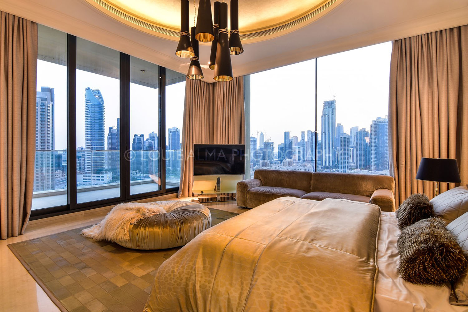
With all this talk of minimalism, you would be forgiven for thinking that mid-century modern styles were cold and uninviting, quite the opposite. As with any aesthetic, there are degrees of extremity, and pared-down styles are no exceptions – it’s entirely possible to have a cozy mid-century living room.
The good news is you can make your modernist home cozy and inviting without sacrificing any of the pared-down styles. Simply choose warm accent colors like red, orange, and yellow and bring in large patterned cushions that make the place cozy but still have the aesthetic you want – the best of both!
Plant Haven
Mid-century modern styles have many traits, including minimalism and unconventional ideas but they also have their roots in nature, you will find many simple organic forms and natural shapes. This again provides ample opportunity for homemakers to create spaces full of life and interest with plants.
Plants can be a wonderful addition to the home and complement the mid-century modernist aesthetic, but it still requires some thought and artistic arrangement. If you want to complement your mid-century room with plants, look for ones that are tall, slender, and a healthy shade of green, of course.
Eclectic Mix of Old and New
Once again, the modernist adage “make it new” comes into play with an eclectic mix of old and new styles. Modernism has a tradition of juxtaposing colors, lines, and styles to create interest and avoid conventional ideas; naturally, this has become a style of its own and works well in modern interiors.
If you like to mismatch your clothing, then you might like to mismatch your interior design styles as well. Some ways you can accomplish this include using colors that clash, shapes that disorientate, and furniture items from contrasting eras – think creatively, and you’ll be right on-trend.
Final Thoughts
Mid-century modern style is sleek, linear, and long-lasting – it is long-lasting in both its style and its content when you consider the choice of material used during the peak of this interior movement. Modernist furniture that dates from the 1940s and 1950s is usually made from hard-wearing teak.
If you decide to embrace a mid-century modern aesthetic for your home in the 21st Century, there are several advantages. For one thing, you will have plenty of space and room that is as easy on the eye as it is on the mind. Furthermore, you get the agency to get creative with styles and forms of different eras.
Finally, mid-century modern homes don’t date easily, and if they do, they can be easily updated with some creative endeavors. This style benefits from juxtaposition and accent wall features so you can change with the times or according to your moods – this unique style offers plenty of inspiration.
FAQs
What furniture do I need for a mid-century-style living room?
In many ways, modernism is a form of minimalism, aesthetically and philosophically, the movement aims to reduce works to their component parts and make the essence of the object speak for itself; this style has seen a revival in the early 21st century with the rise of the internet and minimalist ideals.
Regarding furniture, a mid-century style means pared-down linear pieces that often use smooth surfaces and high-quality wood. In general, the mid-century look is lightweight and thin-framed with tapered ends. Mid-century furnishings such as Scandinavian and boho are naturally modernist.
Is it worth buying original mid-century furnishings?
If you love mid-century modernism, there are a few ways to go about investing in furniture; you can buy original items from the 20th century, imitations from the 21st century, or secondhand pieces picked up in thrift stores and antique shops – but is it worth the investment, and how does it date? The answers very much depend on your tastes and the size of your furniture budget. If you love mid-century modernism, it’s unlikely you will grow tired of your investment; in that case, you can consider more expensive pieces, but if you change your mind it’s better to go with budget furniture.
Where can I get more inspiration for mid-century interior design?
A good place to start is right here – we have numerous in-depth articles and reviews of this classic design style. But if you want to broaden your search, there are plenty of places both online and offline where you can explore the beauty of the items and the philosophies behind them.
Once you know what to look for with regards to mid-century modern, you will be able to source furniture items anywhere and choose interior design arrangements that highlight your modernist sensibility. Look for clean lines, pared-down furniture, and dynamically juxtaposed items.
The image-editing needs of less-experienced photographers often enable them to side-step complicated tools and techniques. Other times there are seemly seemingly advanced tools than can make a big difference in an edit, and these can be greatly simplified for Photoshop novices so that everyone on can get in on the action.
Today’s topic is Photoshop’s Content Aware Fill capabilities that Beckham defines like this: “As the name suggests, it will fill in parts of the image using other parts as a reference.” His demonstration shot is one you may recall from an earlier lesson on adjusting vertical and horizontal lines. And it’s a perfect example for what you’ll learn how to do today.
For this episode Beckham took his previous geometric adjustments to the extreme, and you’ll see that by doing so the upper and lower right corners of the photo are now devoid of content—making the repair a perfect job for Content Aware fill. Beckham starts by giving Photoshop “some guidance on what we want to repair.”
To do that he uses Photoshop’s Polygonal Lasso tool to make a quick selection of the empty upper-right area of the image. He then clicks on Edit atop the workspace and selects Content Aware Fill from a dropdown menu that appears. As you can see, the screen splits in half, with the left side showing an area in green where the repair is drawn from.
The right side of the screen displays a preview of the fix that’s being done. Without any input on your part the settings are set to Auto, and in this instance the repair already looks perfect. So as Beckham says, “If it ain’t broken, let’s not fix it.” He also demonstrates a few ways to output the repair, depending upon how you want to proceed.
Like other Photoshop tools, Content Aware Fill doesn’t always nail the job to perfection automatically, especially when working on more complex images. And that’s when it’s time to make a few simple refinements to complete the transformation
During the remainder of this lesson Beckham walks you through such scenarios and quickly demonstrates the simple steps required with each of his examples. He also provides several helpful keyboard shortcuts for accelerating the process. After watching the video pay a visit to Beckham’s instructional YouTube channel, where you’ll find more helpful episodes designed for beginners.
We’re all taught to avoid shooting outdoor portraits in direct sunlight, and some photographers shy away from using flash to fill in shadows and balance the tones. In this quick video you’ll learn how to capture beautiful portraits in “bad” light” without supplemental light.
Instructor Marco Castro is a Miami-based pro who definitely has the technique down. You’ll follow him in this behind-the-scenes lesson as he captures beauty portraits of a pretty model with available light. You’ll pick up several powerful techniques as he shoots at the beach, on the street, and at other outdoor locations that each require a slightly different approach.
The lesson begins with a discussion of wardrobe and styling for the session, carefully matching attire and accessories to each destination. His model is experienced and he relies upon her input for this as well as later in the shoot when posing and composition come into play. Castro always treats models with respect, which is why he brings a “dressing tube” so they have privacy while changing clothes.
Now it’s time to address the light, and Castro demonstrates a variety of possibilities as his model poses against a tree while directly facing the camera. Another way he collaborates with the model is showing her the photos he captures to determine which shots she prefers—an effective way to gain trust and keep a subject comfortable throughout the shoot.
Castro also reveals the gear he prefers for this type of portraiture and you’ll find a complete list of his equipment in the description beneath the video. You’ll also see how he often reshoots an image with a light tweak or two after hearing what the model has to say.
The shoot then moves on to other locations as Castro switches up his vantage point, camera settings, and employs a variety of other poses that work really well for his style of environmental portraiture. Sometimes all it takes to get a great shot is to have the model recline or sit on the ground. Other times including a found object or interesting foliage in the background can greatly heighten interest and help tell a story.
Another way to capture compelling portraits in bright light is to use a longer lens or move in closer for a much tighter framing. The approach requires a different types of poses, and the position of a subject’s hands and her facial expressions can be extremely important.
After taking a short walk and trying a few other locations, different clothing, and appropriate techniques, the session concludes on the beach where he shoots several images with an enticing swimwear look. You can find more videos like this one by visiting Castro’s popular YouTube channel.