Quick No-Noise Fix for Underexposed Photos (VIDEO)
There are a variety of Lightroom techniques for rehabilitating underexposed photos, yet some methods come with a catch: They do a good job of repairing exposure but may introduce unsightly noise in the process.
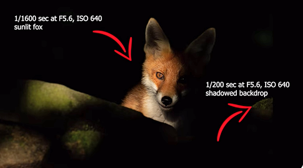
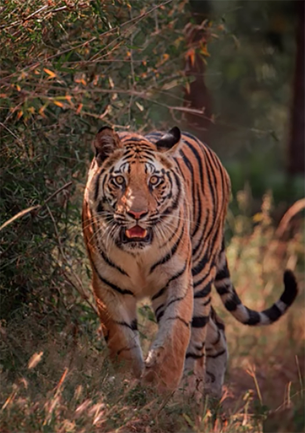
This tutorial from the popular PHLOG Photography YouTube channel demonstrates a clean-and-effective solution that you’ll want to include in your everyday Lightroom workflow and use with confidence whenever your images are too dark. Instructor Christian Mohrle invites you to download his demonstration image with a link beneath the video and make the changes yourself as the steps are explained.
The first step takes place in Lightroom’s Details panel where he quickly applies some AI Denoise by clicking on a button near the bottom of the screen. Then click on the Enhance button and Lightroom does all the work—creating a new image that’s basically noise free.

Mohrle then walks you several global adjustments to prepare his photograph for the masking magic that follows. He begins by changing the profile from Adobe Color to Adobe landscape which instantly boosts base saturation.
The next preliminary step involves revealing more detail from the darkest portions of the photo. He significantly boots exposure and explains there’s far more control because you first applied Denoise. Now you can adjust the Shadows and Blacks sliders to bring out even more detail.
Mohrle also enhances contrast by increasing the whites, dropping highlights and modifying white balance for a slightly warmer look, boosts vibrance and texture, drops clarity and dehaze, and adds introduces an overall Golden-Hour Glow. As you’ll see, these simple global adjustments alone create a very impressive initial transformation.

Now the fun part begins by applying masks selectively to make several enhancements to different areas of the photo, and Mohrle’s illustrated instructions are super easy to follow. The eye-catching edit concludes with a bit of final color grading, very careful sharpening, and filling in a few gaps in Photoshop.
The PHLOG Photography YouTube channel is full of how-to videos for avid outdoor photographs who want to improve their shooting and editing skills.
We also recommend watching the post processing tutorial we featured earlier with another Lightroom expert who demonstrates how easy it is to rid photographs of unwanted people within the frame.