9 Must-Try Lens Filters for Photos and Videos (VIDEO)
Some photographers, like today’s instructor Joris Hermans, simply can’t stop themselves from purchasing lens filters in the hope that these affordable accessories will protect their expensive lenses, create unique effects, help modify light, and magically add impact to the photos and videos captured outdoors.
As time goes by, a few of these filters become trusted companions, others are only employed on rare occasions, and some are set aside and never see the light of day more than once. If you’re suffering from this strange form of Gear-Acquisition Syndrome, please accept our heartfelt condolences.
To complicate matters, some of us purchase the same filter in various sizes to accommodate a variety of regularly used lenses, and this is where things can get expensive—to say nothing of cluttering up your bag. Hermans sets aside his filter obsession for the next 10 minutes as he takes a close look at nine filters he says everyone should try.

Hermans describes the intended purpose of his top picks and provides a quick discussion of how each can best be used to fulfill specific goals. His first favorite is the widely used Neutral Density (ND) filter that’s a favorite among landscape photographers, and this one not only comes in various sizes but in different strengths as well. In simple terms, think of ND filters as “sunglasses for your camera because they enable you to control the amount of light reaching the sensor.”
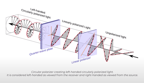
Another ubiquitous choice is the polarizer which can be helpful for several reasons. By turning it’s rotating front ring you can darken pale blues skies, increase vibrance and saturation, and remove or reduce unwanted reflections on not-metallic surfaces like glass, water, and the like. This filter can be more or less effective depending upon your angle relative to the sun, and it’s important not to take things too far because a total lack of reflections can impart a lifeless look to a shot.
Mist filter are often used by landscape and nature photographers to imbue images with a moody or “atmospheric” appearance that can be quite intriguing—even when shooting on clear days. The extremely dark solar filter, on the other hand, serves one primary purpose: namely, photographing the sun.

By following Hermans’ advice you’ll save some cash by avoiding unnecessary temptations while enhancing your outdoor images in various ways. Be sure to visit his instructional YouTube channel for more tips, techniques, and worthwhile gear recommendations.
Another quick way to modify the appearance of your images involves using presets during post processing, and we recently posted a story offering a free pack of these timesaving tools. So be sure to take a look and take advantage of this time-limited offer.


