Beginners Guide: Manual-Mode Photography Made Easy (VIDEO)
There’s a notion going ground that photographers aren’t serious about the craft unless the mode dial on their camera is set to “M.” We strongly disagree, but if you want to experiment with Manual mode photography this tutorial explains everything necessary for getting started today.
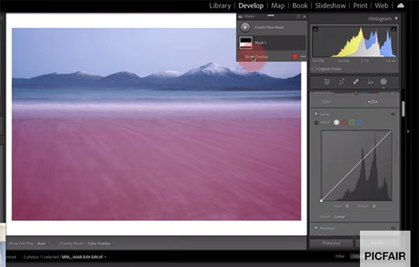
While many pros use Aperture Priority, there are admittedly advantages to shooting in Manual depending on the type of photos you make. Instructor Ejaz Khan puts it like this: “Manual mode photography is the key to unlocking your creative potential.” So forget what you’ve heard about the complexity of this technique and watch Khan demystify the process in barely nine minutes.
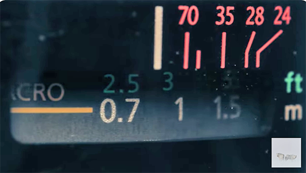
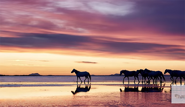
Khan is a professional wildlife photographer who begins with this promise: “After this video you’ll think that Manual mode is super, super easy and understand how it brings you closer to your audience.” He simplifies the technique by comparing the camera’s “three essential” components—ISO, aperture, and shutter speed—to three children needing light as their “food” for perfect exposure.
The lesson provides other interesting analogies, clear illustrations, and step by step-by-step instructions for beginners and experience photographers alike. Khan says that his goal is to help you embrace the benefits of Manual with precision so that automatic settings don’t limit your artistry.
Khan’s video is jammed packed with straightforward camera-setting suggestions and shooting technique that are designed to help you better understand exposure and tonal balance with confidence using just about any camera you own. So grab your camera, take a deep breath, switch the Mode dial to “M” and follow along as you watch how it’s done.
There are many more instructional videos like this one to be found on Khan’s popular YouTube channel, so be sure to take a close look and see what strikes your fancy.
And for another helpful beginner’s guide, be sure to watch the tutorial we featured recently with another accomplished shooter who provides a 10-minute demonstration of all the basic iPhone camera settings necessary for capturing dynamic mobile photographs instead of mere snapshots.