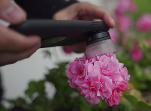
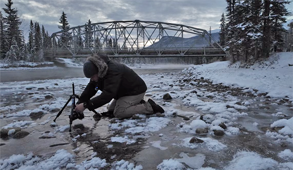
The Sony FE 24mm f/2.8 G is one of the smallest full-frame lenses available for Sony mirrorless cameras, weighing just 162 grams (0.36 pounds) and measuring a mere 4.5 cm (1.8 inches) long. Is this small form factor paired with good performance, or did Sony cut some corners to get the weight this low? In today’s review, I’ll answer all your questions about the Sony 24mm f/2.8 G!
Experienced landscape photographers know that some intense colors are difficult to deal with during the editing process, especially when processing images captured just as the sun drops below the horizon. In this tutorial from the PHLOG Photography YouTube channel you’ll learn how to render these vibrant tones in Lightroom while achieving a realistic effect.
Instructor Christian Mohrle is an accomplished German nature photographer who we frequently turn to for solutions to challenging tasks like this. Feel free to use the link beneath the video to download the demonstration image so you can make the changes yourself while watching Mohrle work his magic.
Mohrle describes the task like this: “Every now and then I can capture an insanely vibrant sunset like this. The problem is that once I fix the exposure and play around with the colors a bit they start to look strange.” He then walks you through his method for handling these intense tones to create a natural looking image.
As always Mohrle begins with a few global adjustments to prepare the overall photo as much as possible for the selective enhancements that follow. In this case the first step is changing the profile from Adobe Color to Adobe Landscape. This may sound counterintuitive because this profile significantly boosts base Saturation, but Mohrle has a good reason for doing so.
Other preliminary enhancements include modifying exposure to accentuate detail in the sky and dark foreground. Mohrle also raises the blacks, increases color temperature, brings down the tint to reduce a magenta color cast, and adjusts Texture, Clarity, Dehaze, and Vibrance. At this point many of us would be pleased with the image just as it is.
But watch what happens when Mohrle employs a bit of masking to selectively adjust various areas within the frame. He adds a Linear Gradient over the top right of the sky, another Linear Gradient over the same side of the foreground, and a hard-edged selection over everything below the horizon. The adjustments to each of these areas are very simple, but they have a huge impact on the photo.
Once again you may think the image is ready for prime time, but Mohrle has a few other tricks up his sleeve that deliver the eye-popping effect he desires. These include further refining the colors, fixing chromatic aberration, and carefully adding a bit of subtle sharpening.
All that’s left to complete the remarkable transformation is cleaning up the image in Photoshop. Voilà! It’s well worth paying a visit to Mohrle’s instructional YouTube channel where you’ll find a wealth of information for improving your landscape photographs.
The craft of photography is full of long-held concepts and conventional wisdom that have proven helpful for years. But as technology, techniques, and editing software have evolved, some of these so-called “rules” deserve to be pushed to the wayside.
One good example has to do with ISO, and how higher settings will introduce noise and degrade image quality. But according to landscape pro James Vooght, there are several good reasons you should feel safe cranking up ISO within reasonable limits—depending upon the specs and capabilities of the cameras you use.
You’ve heard it all before: High ISO settings spoil photo by introducing image-killing artifacts and sensor noise. Always shoot at ISO 100. Images shot at ISO 6,400 and above will be awful. Blah, blah blah. If any of these notions resonate with you, pay close attention to this episode because you’ll likely rethink your approach by the time the video concludes.
In barely seven minutes Vooght explores the history and theory behind the concept of ISO. He tackles sensor noise and discusses situations in which high ISO settings can be your ally without a big sacrifice in image quality. In short, it’s no longer a matter of only using high ISO as a last report when prevailing conditions make lower settings “impossible.”
Vooght also provides valuable insight into the “Expose to the Right” technique, that is capable of transforming your photography skills—especially when shooting in low light. He puts it like this: “As photographers we must learn to work with—and not against—the challenges posed by the environment and the specific equipment that we have.”
The fun part is that Vooght takes a unique approach with this vital lesson. As you might expect, he demystifies the concept of ISO and explains what you can achieve at high settings with proper technique using whatever gear you own. But, as you’ll see, he goes beyond traditional lessons on this important topic.
Prepare to respond because Vooght throws down the gauntlet: “I want to challenge you to use high ISO creatively and embrace it whenever necessary.” You’ll be able to do exactly that by following his straightforward suggestions. Although you may want to reset your brain before resetting your camera to higher ISO settings than those you dared use before.
Vooght posts weekly videos like this, on a wide variety of popular topics, and you can find everything he has to offer by exploring his interesting YouTube channel.
Most photographers rely upon the Tone panel in Lightroom or Adobe Camera Raw (ACR) when processing their images. But guess what? There’s a good chance you’re not using these important tools correctly. In today’s quick tutorial from the Photoshop Café YouTube channel you’ll learn what you may be doing wrong, and the proper way to proceed.
Instructor Colin Smith is a widely respected image-editing expert who kicks of the eye-opening video like this: “All sliders aren’t created equal and they shouldn’t necessarily be used the same way.” He notes further that there are two completely opposite functions that we can employ with the Tone sliders and you’ll see how all this works in barely five minutes.
Smith pulls up the Tone panel and explains the difference between using the Highlight/Shadow sliders and those for adjusting Whites/Blacks. As we’ve mentioned before, it’s very important to make enhancements in the proper sequence. And this is what Smith recommends: “First recover detail, then stylize your photo.”
There’s also a cool trick that makes these adjustments easier and provides significantly more control. By clicking on the Tone panel and dragging it to the left, the sliders almost double in length. This means adjustments will be far more precise because you’re making them in finer increments.
As for the adjustments themselves, Smith’s first goal (as mentioned above) is bringing out as much detail as possible in both Highlights and Shadows while temporarily leaving the White and Black sliders alone. He refers to the former as “recovery sliders” and demonstrates what he says is the best way to get the job done.
If you can’t achieve enough detail and color recovery in a bright sky by dragging down the Highlights slider, it’s easy to refine the result with the Exposure slider until you see exactly what you want. He then demonstrates the process he uses to accentuate details in the dark areas of the shot. Slightly cutting Contrast will also reduce Dynamic Range.
The next step in the straightforward process is what Smith calls “adding punch,” and this is where the Black and White Sliders come into play.” Once again he provides a helpful tip, this time for avoiding clipping as you adjust these tones.
The Whites look pretty good in Smith’s demonstration image, so he focuses his attention on the Blacks to really punch up the shot. The technique is super simple but makes a big difference as you can see by examining the before/after examples.
Be sure to check out Smith’s instructional YouTube channel, once you’re done watching, where you find more tips and tricks for editing images to perfection.