Photo Challenges, Week 6
We are now on our sixth week of our photo photography theme challenge and Raw editing challenge.
Printing and framing photos is a great way to decorate your home or office and gain a bit of recognition for your hard-earned efforts. It’s also easier to evaluate your work with a large hi-res print in hand, rather than reviewing images on the computer.
There’s a lot to consider if you want optimum results, from prepping the photos properly, selecting the right paper, and deciding whether to order the prints from a local shop or from a respected online source. While most photographers like to go big, it’s also important to determine the best print size based upon how you intend to display your images.
The quick tutorial below is intended for those new to the process, but you’ll likely pick up a few helpful tips even if you’ve done this before. Nature photographer Toms Jurjaks regularly posts tutorials for budget-minded shooters, and he covers everything you need to know in barely nine minutes.
The first consideration is choosing the right printshop and this requires a bit of research, and hopefully some advice from friends who have a favorite source. Jurjaks notes that quality varies among from one shop to another, so this is a very important step. Jurjaks says local printshops, if you have one nearby, may offer more personalized services and faster turnaround times.
Online sources, on the other hand, typically offer lower prices for the same or better quality. Jurjaks say that when visiting a local shop you should make sure they use professional-grade printers and have a reputation for producing great output. It’s usually possible to read online reviews if you can get a recommendation from a friend. The same criteria hold true when selecting an online source.
Jurjaks says it’s also critical to review and become familiar with the range of papers and finishes offered by a printshop, because “different papers can drastically change the look and feel of your photos.” While some images, like detailed landscape photos, work best on glossy paper, soft and subdued photos often look better on matte paper with a non-reflective surface that imparts a more artistic appearance.
And as Jurjaks explains, “fine art paper has a textured surface that adds depth and a luxurious feel to your prints.” So now you’re ready to place an order, right? Well, not so fast, because there are a couple more important tasks before it’s time to pull the trigger.
Before placing an order, you must make sure that your file is edited to your liking and properly prepared according to the specific requirements of your chosen source. This is an easy-but-important task, and Jurjaks walks you through the process.
The final step is to carefully place the order, and when using an online shop you can usually do that via a form on the website. Sometimes you also have the option of downloading an app and making your order from that. Jurjaks has a few suggestions for what to look for so you get exactly what you want.
After watching the video pay a visit to Jurjaks’ YouTube channel where there’s much more to see and learn.
All good landscape photographers strive to create a style all their own to make their images immediately recognizable and stand out from the crowd. This goal is also important for amateur shooters who want to elevate their work to the next level.
Mike Smith is an accomplished British pro specializing in landscape photography, and he’s also an adept instructor. In today’s quick tutorial he reveals a “secret weapon” that’s partially responsible for his success. The topic is composing a scene with symmetry in mind, and it’s not a difficult technique to master.
Smith discusses the different types of symmetry and how to use them for to create images with maximum impact. He also demonstrates a method for combining symmetry and asymmetry to crease amazing photographs. These techniques can eliminate “chaos” and simplify complicated landscape scenes to create a powerful sense of order.
As Smith explains, symmetry occurs when a scene has two matching halves. He illustrates this concept by drawing a vertical line down the middle of a symmetrical photograph and flipping a copy of one side onto the other. As you’ll see, both sides look exactly the same. Asymmetry, on the other hand, is the opposite.
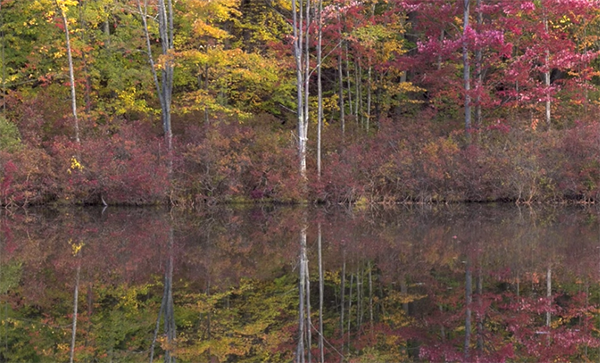
The most common symmetrical form is horizontal, like in scenes with a lake in the foreground and hills in the background. In this situation, especially on calm days, the reflection in the bottom half of the photo becomes a mirror image of the top half. The trick here is to shoot from a low camera position and place the far edge of the lake down the center of the frame. You can even try this technique using a large puddle in the road.
As you may expect, vertical symmetry is another viable option, and Smith uses a photo of Japan’s famous Mt. Fuji to illustrate how this works. Even though this iconic volcano isn’t perfectly symmetrical, the balanced composition really works. You’ll see how this technique is also very effective when photographing buildings and other man-made structures.
Smith presents a second stunning image of Mt. Fuji with a remarkable combination of vertical and horizontal symmetry. The foregoing is just a smattering of what Smith’s reveals in this lesson, so watch until the end and put your newfound knowledge to work.
There’s much more to see on Smith’s instructional YouTube channel, so be sure to take a look when you have time.
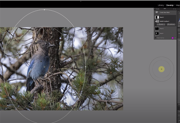
And don’t miss a tutorial we posted earlier from an image-editing exert, explaining how to add impact to landscape photos by using masks in Photoshop’s Raw editor.
Whether you’ve dabbled in b&w photography or always shoot in color, you’re likely aware that some subjects can be more impactful in monochrome. There are basically two choices if you want to give this a try: Set your camera to B&W or shoot in color and convert the image to b&w during the editing process.
This tutorial from the This Guy Does Photoshop channel is all about the later approach with a slight twist. Instructor Shawn Dolinski demonstrates one of the most compelling forms of b&w conversion; namely, those with a dramatic high-contrast look that really grabs attention.
This particular effect is created by using a variety of adjustment layers, Camera Raw filters and a bit of straightforward Layer Masking. This mouthful may sound rather complicated, but the method is actually easy enough for photographers of all skill levels. And the results are awesome.
Dolinski demonstrates the technique using portrait photos, but this approach can work wonders for landscapes and other types of images. So think about ways you can put these tips to work while watching the video. The first step is to open an image in Photoshop and use a Gradient Map adjustment layer to convert the photo to b&w by following Dolinski’s simple instructions.
Dolinski then demonstrates how to employ a simple slider to adjust highlights, mid-tones, and shadows until you see what you like. Next comes another adjustment layer that initially sounds a bit strange. That’s because even though your image is already b&w, you’ll see sliders for various colors. These able you to adjust various tones based upon colors in the original image.
Once you’ve adjusted colors and tones to your satisfaction, it’s time to selectively enhance specific areas in the photo so they stand out—specifically in terms of brightness. With portraits, for example, that may mean the eyes and/or lips. This straightforward step involves the use of Curves in the manner Dolinski suggests.
With the conversion now looking pretty great, Dolinski now merges all the initial adjustments using the timesaving keyboard shortcuts provided. Now he employs Photoshop’s Level’s tool to create a subtle spotlight effect.
After a few final refinements the transformation is complete. If you compare Dolinski’s original color image to the high-contrast conversion, the drama will smack you in the face. You can find more helpful lessons like this one by paying a visit to Dolinski’s YouTube channel.
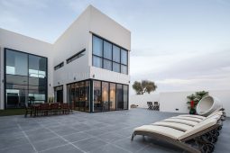
We also suggested watching the tutorial we posted from another pro, demonstrating five pro tips for shooting dynamic architectural photos (that often look awesome when converted to b&w).