How to Shoot Great Outdoor Photos in Soft Light (VIDEO)
Today we’re exploring the characteristics of soft light and the different ways it can affect the impact of outdoor images, whether they’re landscapes, environmental portraits, or just about anything else. This tutorial comes to us from the folks the Great Big Photography World—a YouTube community of passionate creatives with a comprehensive range of lessons for shooters of all skills levels.
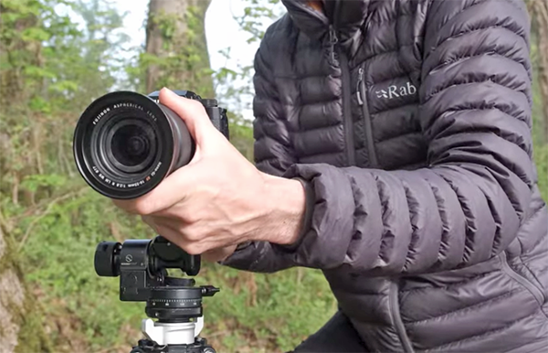
Today’s unnamed instructor kicks off the lesson with this: “Learning how to control soft light is an essential skill for all photographers.” This type of light is created by relatively large light source, like bright overcast skies or when light clouds momentarily enter the frame.
There are several ways that conditions like these can lessen the impact of an image, by muting colors, sacrificing detail, and introducing an overall flat appearancs devoid of contrast that’s less than ideal. Fortunately. there are several simple techniques and a couple of affordable accessories that will dramatically improve the impact of photos shot in soft light.

One basic fact is this: The closer a light source is when falling on a subject, the softer it will appear and the smoother the shadows will be. This not only holds true when shooting in the field, but when making indoor portraits by indirect window light.
As you’ll see, a simple lightweight umbrella can be a big help outdoors when the subject is close to the camera position—especially in mixed light. Examples include macro photos, portraits, and even when there’s a key element in the foreground. The trick is to learn how to control the light, because bad things tend to happen when it’s too diffused.
Another important consideration is the difference between shooting under deep cloud cover and intentionally positioning a key subject in the shade on brighter days. The instructor also reveals his recommended camera settings and exposure modes for different situations because “there are varying levels of soft light”—each requiring a unique approach.” And if the sun peaks out from behind the clouds and becomes too harsh, there are ways to prevent that direct illumination from spoiling your results.

We strongly recommend visiting the Great Big Photography World YouTube channel—whether you’re a beginner or seasoned pro—where you’ll find unique projects and helpful lessons on a wide variety of topics.
And don’t miss a tutorial we posted recently, featuring another accomplished pro who explains depth-of-filed mistakes that will prevent photographs from reaching their full potential. Then he provides straightforward secrets for unlocking the power of selective focus.