Nikon just announced the first f/1.4 lens for the mirrorless Z system, the Nikon Z 35mm f/1.4. That’s the full name of this lens; there’s no “S” designation, which is a bit of a surprise. Another surprise is the price: At $600, it’s even cheaper than the f/1.8 version!
This tutorial is sure to turn some heads, so if you enjoy surprises you’ve got one in store as a notable pro explains what he says is the easiest way to nail exposure every time. His name is Steve Arnold and he insists that by following his advice you’ll consistently get the light right forever more.
Arnold begins the episode with this promise: I’m going to show you a simple method pros use to easily capture perfectly exposed images without ever having to worry about all the complicated stuff like calculating stops, ambient light or metering so you never have to worry about missing a shot again.”
So what is this miraculous surprise? Manual Mode! You heard us right. Arnold puts it like this: “I want to dispel a common myth and explain why using your camera in any kind of Auto mode is the hardest way to shoot—while using a camera in full Manual mode is the easiest.” We bet you weren’t prepared to hear that.
This notion certainly contradicts conventional wisdom, but we suggest giving Arnold the benefit of the doubt as he explains the reasoning behind this technique that’s supposedly reserved for very experienced shooters.. You may even agree and rotate your camera’s mode dial to “M” by the time this six-minute discussion concludes.
Arnold provides this reminder with most photographers would agree: “When shooting in full Auto, Aperture Priority, Shutter Priority, or even Manual with Auto ISO, you’re letting the camera decide what the best exposure is.” His point is that that there’s room for the camera to get it wrong, and your only choice when this occurs is messing around with Exposure Compensation.
On the other hand, “If you want to take all the decisions away from your camera and capture exposure at the right levels for what you’re doing, then Manual mode is the only way to go.” Many photographers would also agree with this statement. What raises eyebrows, however, is Arnold’s insistence that shooting in Manual is easier that using one of the automatic modes.
His explanation is this: “I’m going to lay it out in a way that’s easy to understand and even easier to use when you’re out in the field and it’s crunch time. I’ve got it down to a simple step-by-step process that anyone can follow.” So take a look and give it a try. If this approach works for your there’s an added bonus: You can ignore all the purists who insist that “you’re not a real photographer unless you shoot in Manual.”
We often discuss the importance of using masks to make selective enhancements to a photo, rather than just relying upon global adjustments that affect the entire image at once. There are a variety of options available, and this tutorial from the PHLOG Photography YouTube channel demonstrates one of the most useful techniques.
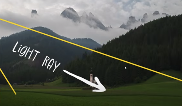
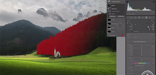
The topic for today is Lightroom’s versatile Object Mask tool that simplifies the process for precisely targeting specific elements in a scene without biasing other areas within the frame. German landscape pro Christian Mohrle explains everything you need to know in barely 11 minutes, and we suggest following along by downloading the sample image using the link in the description beneath the video.
Mohrle’s beautiful edits always follow a specific sequence, beginning with several of the aforementioned global adjustments to prepare his photo for the selective masking techniques that follow. Today he’s working with an HDR image so the first step is merging the five bracketed files. He then changes the profile from Adobe Color to Adobe Standard which provides more control over contrast later in the process.
He then modifies White Balance to warm up the shot, drops overall exposure and highlights to bring out more details in the sky, and slightly opens up the shadows. Other preliminary adjustments include carefully bumping up whites, introducing more texture, clarity, and dehaze, and pumping up colors with additional vibrance.
Now that the image is significantly improved, it’s time to further enhance the shot with Lightroom’s Objects Mask tool. There are two options for leveraging this tool: The default approach uses a brush to select the object to be enhanced—in this case a boulder in the foreground that needs to be accentuated.
Mohrle turns to the second option for targeting the jagged mountains in the distance, because they’re too complicated for the brush. Instead he employs the Rectangular tool and demonstrates how to achieve a precise selection of the peaks and make the necessary enhancements.
Once the masking is finished Mohrle completes the impressive transformation with careful color grading and a bit of judicious sharpening. The effectiveness of this straightforward technique is readily apparent when you compare Mohrle’s before/after images.
If landscape photography is your thing we strongly recommend checking out Mohrle’s robust YouTube channel where there’s much more shooting and editing advice to be found.
Greek storyteller Aesop once said, “It is possible to have too much of a good thing,” and that’s the motto of today’s Lightroom tutorial as it pertains to over-sharpening images. In other words, if you go overboard with this task, or do it wrong, you’ll end up with too much of a bad thing and spoil your work.
According to instructor James Feaver, “most modern lenses are really sharp and provide a great balance between sharpness and creamy out-of-focus bokeh.” With that in mind, he demonstrates how three Lightroom sliders will prevent you from creating a crispy mess.
The key to finding the right balance, says Feaver, is understanding Lightroom’s Texture, Clarity, and Dehaze tools and how far to push these simple sliders before image quality begins to go sideways. Beginners tend to cross the line, just as they often do when oversaturating photos to the point of absurdity. The point is that a subtle approach delivers images with a realistic look.
The three “Presence” sliders that Feaver recommends are found within the Basics panel just beneath the Tone array. The Texture, Clarity, and Dehaze sliders work in a similar ways, and the difference is a matter of degree and where they affect the image.
As the name suggests the first tool discussed is used to increase or decrease the attribute known as texture, while still retaining fine details. Moving the slider to the left reduces unwanted, medium-sized details. Move it to the right and the opposite effect occurs.
The Clarity tool is used to control the appearance of edge contrast in a photograph, and unlike with Texture it’s intentionally biased towards the midtones of an image. It also affects luminance and saturation is a greater way than does the Texture slider.
Lastly, Lightroom’s Dehaze technology is based upon “a physical model of how light is transmitted, and it estimates light that’s lost due to absorption and scattering through the atmosphere.” With this tool there is relatively little change in highlight areas, while the shadows are more dramatically altered as the slider is moved.
With all this theory out of the way, Feaver walks you through a practical process for putting these siders to work—individually or in tandem. Bottom line: the next time you attempt to sharpen a soft photograph, think back to Aesop and take a subtle approach in the manner Feaver recommends