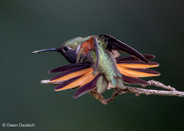
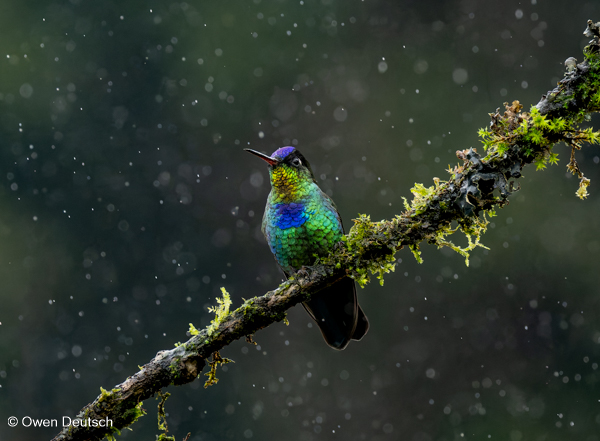
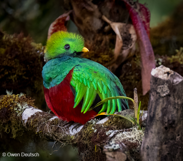
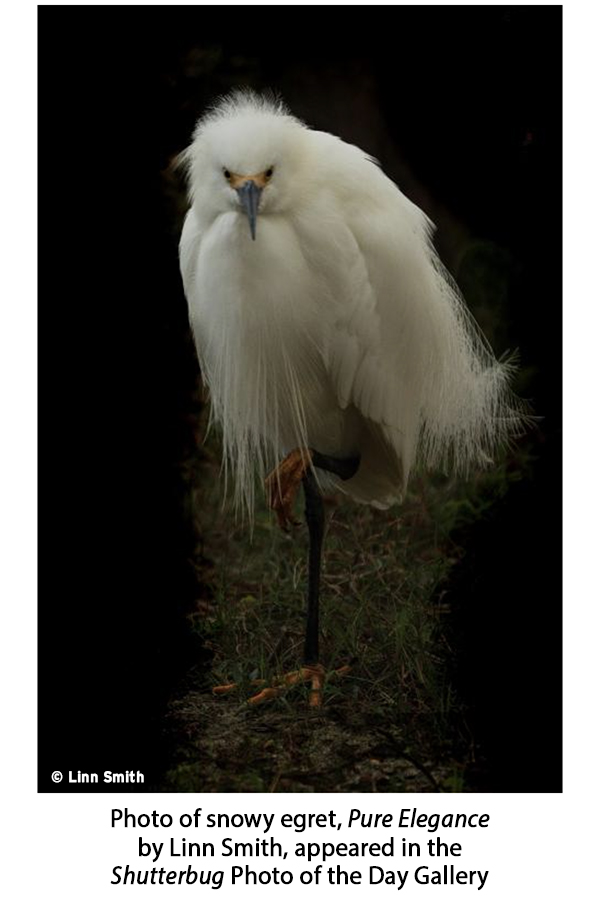
Shutterbug readers love photographing birds. One look at our Photo of the Day gallery confirms it. So we asked Owen Deutsch, a renowned bird photographer, to share his expert advice.
Owen Deutsch is a Chicago native. He had a 20-year career as a fashion photographer and then retired in 1986 to launch a second career in real estate development. But everything changed in 2002 when he was introduced to birding by a close friend who asked for some help with his bird photography.

A whole new world opened up to Owen, and he was hooked. He was back in the beauty photography business again, but this time it was birds, butterflies, and all the magnificent creatures of nature in front of his lens. Nowadays, Owen travels all over the world in pursuit of his passion, and his extensive website is a way of sharing his love of birds with friends.
Owen’s latest book, Birds of the Tropical Andes, will hit the market on July 8, 2025. Note that 100% of the royalties from this book will be donated to the American Bird Conservancy to help fund their conservation efforts throughout the Americas. More on that later.

Owen Deutsch Q&A with Shutterbug
What is the single most important piece of advice you can offer to amateur bird photographers?
It’s difficult to provide a single piece of advice, but here are some tips for those keen to get started in bird photography. First, keep it as simple as possible. Don’t spend too much time deliberating about which camera brand to use, but do invest in the best brands you can afford. The best camera you can have is the one in your hand. Besides, the top brands of cameras leapfrog each other constantly.
Next, practice. Take lots of pictures and keep honing your craft. Make goals and work hard to achieve them.
Third, study the art of photography in whichever way works best for you. Personally, I was never good at learning through photography classes or traditional learning methods. I am a hands-on learner.
Finally, seek advice. Find people you admire and ask questions about their work.
And most of all, have fun!

Where is your favorite place in the US to photograph birds?
Chicago, Illinois, my home city, as it’s packed with great places to shoot! Montrose Point Sanctuary, also known as the Magic Hedge, is a small (15 acre) area, just four miles north of downtown, right by the lake, and it’s a real gem if you’re into wildlife photography.
It offers great scenery and attracts 300 bird species annually. It’s known as one of the top birding locations in Illinois. The best time to go is early in the morning (just after sunrise) when the birds are active.
Montrose Point is a hot spot for birdwatchers because it sits right on a major migration route, so hundreds of different bird species pass through every year. I’ve been visiting this photo spot since 2001 and still photograph there regularly. I’ve captured everything from Red-tailed Hawks and Yellow Warblers to Sandpipers and Owls like the Whip-poor-will, and many more.
Even though it’s well-known in the birding world, it may not be as known to other photographers. A lot of people don’t realize this peaceful little haven is so close to the city. If you’re looking for something a bit off the beaten path, the Magic Hedge is definitely worth checking out.
On my website I list more North American birding destinations around the Chicagoland area on our Sites and Lodges page.

What is your typical equipment set up? Type of camera, focal length of lenses, and so forth?
I use two Nikon Z9 mirrorless bodies with the 800mm f/6.3 lens on one body and a 100-400mm f/4.5-5.6 lens on the other. I will also sometimes use my older 500mm f/5.6E PF lens (that I’ve kept from the days when I used DSLRs) in conjunction with an adapter on my mirrorless bodies; the bokeh is so lovely, I couldn’t part with this lens.

How and where can our readers buy your book that comes out on July 8th?
I’m set to release my latest fine art photography book, Birds of the Tropical Andes, in collaboration with leading conservationist Michael J. Parr, President of the American Bird Conservancy on July 8, 2025. Published by Princeton University Press, the book showcases more than 200 of my avian portraits captured during years of expeditions to one of the most biodiverse mountain ranges on Earth.
The book features a foreword by renowned ornithologist Álvaro Jaramillo, essays from leading conservationists, and a powerful call to action to protect this irreplaceable ecosystem.
100% of the royalties from Birds of the Tropical Andes will be donated to the American Bird Conservancy to help fund their conservation efforts throughout the Americas.
Birds of the Tropical Andes is available from Princeton Press.
Enormous thank you to our friend Zoe Hiljemark, a world-class publicity / visibility consultant for photographers, who made this story possible.

Join the Shutterbug Community!
Sign up for a free account. It’s easy. Subscribe to our free newsletter (see sign-up form on our homepage) and bookmark Shutterbug as a Favorite on your browser and check back often. Visit our Gallery section and spend five minutes or less uploading your best shots once a week or so. You may even become a Shutterbug Photo of the Day photographer. In the Galleries you’ll see the amazing work of thousands of photographers from all over the world; add your own images to our ever-growing collection. It’s a great way to connect with other photographers and share your knowledge and passion for photography.
—Jon Sienkiewicz

