Using Contrast & Color to Add Depth & Interest for Nature Photos that Grab Attention VIDEO)
One of the most effective ways to transform good landscape photos into great ones is by adding depth and dimension during the editing process. And an easy way to do that in Lightroom is with straightforward adjustments to colors and contrast.
These simple enhancements make photos more dramatic and compelling and help guide a viewer’s eyes through the scene. This technique is particularly helpful for improving images shot under flat, uninspiring light that results in photos with no apparent depth.
We often turn to Canadian landscape photographer Adam Gibbs for straightforward tutorials designed to improve your skills. In this 15-minute Lightroom lesson he demonstrates how easy it is to create the illusion of depth by changing color temperature and adding or subtracting contrast.

As Gibbs explains, “Contrast can come in many forms including contrast in colors, textures, shapes, and of course light.” The tips he provides for modifying these elements are quite subtle, but they deliver big results. He also illustrates how to accentuate these effects and draw viewers into a scene by using simple masks in Lightroom.
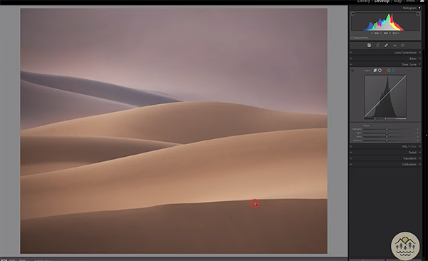
Gibbs employs three images, each with its own problems, to illustrate how all this works. The first is a shot of rolling sand dunes that he captured during a trip to the Gobi Desert. As you can see, this shot has real potential in terms of layering and composition, that was obscured by boring, flat light.
The rehabilitation proceeds with Gibbs noting a positive aspect to the photo; namely that the sky is noticeably cooler that the warmer dunes in the foreground. So he gets started by accentuating this contrast in colors. He notes there are several ways to handle this task, the easiest being the Contrast slider. his preference, however, is to add (or subtract) blacks to achieve the look he’s after. Modifying the whites is also helpful too.

Pay attention to the histogram in the upper right corner of the screen as Gibbs makes these and other simple adjustments. Gibbs says he likes his images nice and bright, so he brings down the blacks and pumps up the whites. Keep in mind that these enhancements are subject to personal taste, and the adjustments you make may differ a bit depending on the mood you’re trying to create.
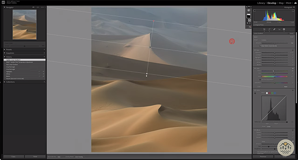
Gibbs walks you through the step-by-step edits he makes to two other images, and you’ll pick up more helpful tips for adding depth to these shots. One of these was shot in the same area as the photo discussed above, and his edit follow a similar path—with a linear filter to improve the appearance of depth.
You can find more landscape photography advice on Gibbs’ instructional YouTube channel, so pay a visit when you have time.
And on a related note, we encourage you to watch a tutorial we posted earlier, demonstrating four helpful tips for shooting landscape and nature photos with soft, blurry backgrounds that make a subject stand out.


