Why Composition is the Key Element in Compelling Images
(Editor’s Note: You can read ”On the Road” columnist Deborah Sandidge’s other columns here).
When I started in photography my pictures were factual; they fulfilled the “here’s what it looked like” requirement and checked off all the familiar guides: a clearly-defined subject; properly placed leading lines; the rule of thirds obeyed; backgrounds taken into careful consideration. But they were static images, and there was no real communication of what the images were about.
I worked hard at changing that, at figuring out what I needed to do in order to creatively communicate. One of the changes I made was to consider the composition of my photographs to be purpose driven, and the images you see here are examples of how that works for me.
Big Bear
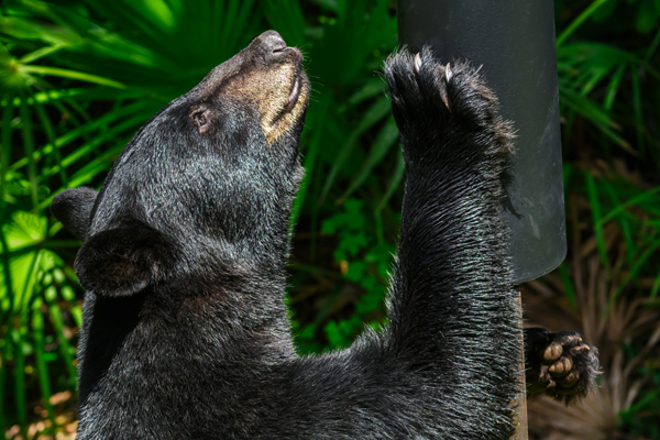
Black bears are common in Florida, and they’re not uncommon in my backyard, where, thanks to my security cameras, I usually see them wandering at the wooded edge of the property. Sometimes, though, they come closer to the house to see if the trashcans are available or the bird feeder accessible.
This guy climbed the feeder post but couldn’t get past the raccoon baffle. I composed this shot from the office-window setup I use to photograph birds, deliberately for effect by filling the frame to communicate my reaction to him—his bulk, the position of paws and claws, his concentration. The photo, taken with my 200mm lens, is not about details, subtlety, or even the story of what the bear was up to. It was all about, Wow, check this guy out!
Location, Location, Location
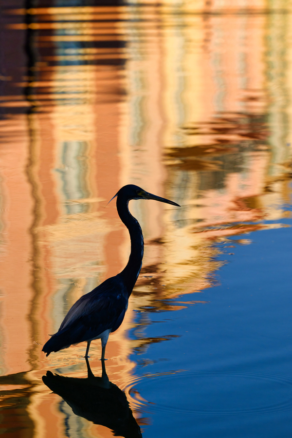
This image was driven by the place and what I knew I’d find there when the elements aligned the way I hoped they would. The Orlando location inspired me with what it offers in late afternoon light, when the colors are richest and beautifully reflect the buildings around the lake on a day when it isn’t too windy. I knew there were birds, and all I needed was one to give me the composition I’d pre-visualized.
This heron, though, was constantly moving, which meant I had to move with it, all the while looking for the right reflections, the right angle, constantly analyzing and evaluating the changes in composition. When the moment was right the combination of my 70-200mm, the 2X teleconverter, and a fast shutter speed of1/1,250—got me the image I wanted.
Into the Sun

While teaching a workshop in St. Augustine, the main photo op was this team hired to gallop the beach at sunrise. The composition was achieved by creating the setup and leaving everything else to camera position and continuous high-speed frame-advance. The workshop folks were shooting away and so was I, and this is one still frame of a sequence shot at 1/5,000. It’s my hero shot, so much so that I used it commercially to illustrate a story at a different website. In a sense, it’s after-the-fact composition—the single frame specifically chosen, at the computer, from all others, some which had the duo closer to sun, past the sun, and at the edge of the frame.
So why this one? Several reasons: the gesture angle of the rider’s lean; the pattern of kicked-up water; the undisturbed reflection; the front hooves clearly seen off the ground; and that the subjects are heading toward the sun, which captures my feeling that the image is both iconic and symbolic.
Bare Trees
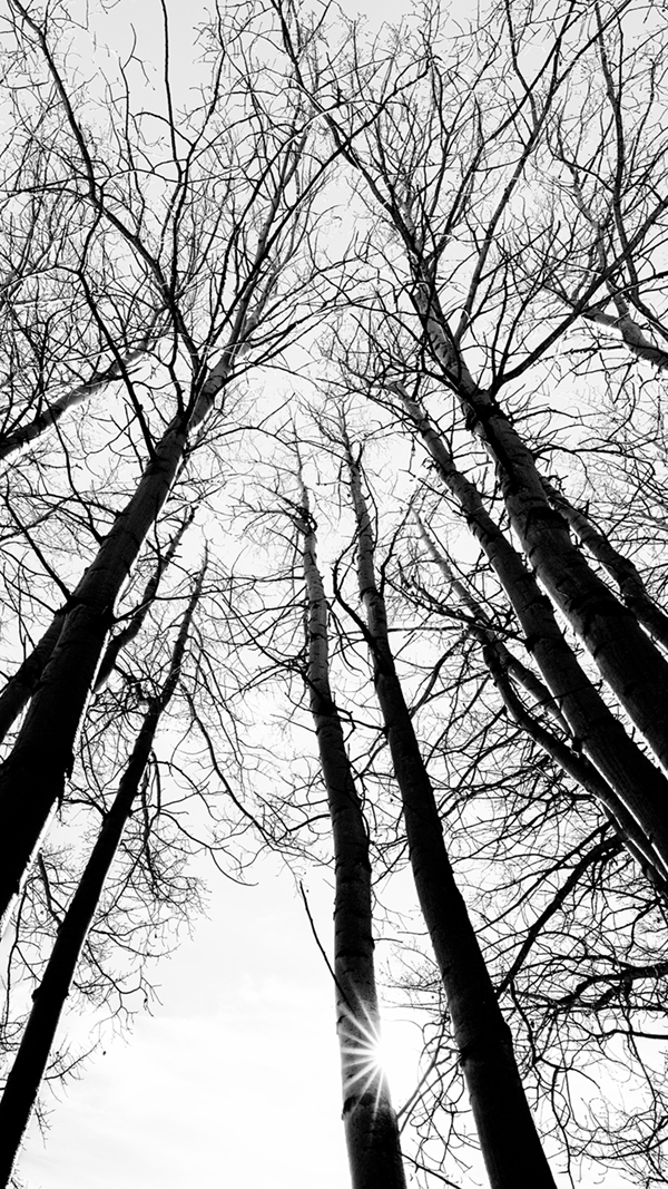
Conditions were right—afternoon sun, clear sky, Colorado location—and I’d gone out to photograph snow. It turned out that there wasn’t much of it, so I turned to what I really liked: how stark the trees were. Their look carried the idea for the composition, but before crouching low and using my Nikon Z9’s tilt monitor to frame the shot, I set the camera’s Graphite picture control because its tones would intensify the starkness that attracted me in the first place.
The composition required two key elements: the sunburst (from an f/16 aperture) and the 14-24mm lens at its widest to tell the most interesting story. I especially like the balance and contrast of the thicker leading lines that draw viewers’ eyes up to the lacework look of the branches. The photo has been likened to a pen-and-ink drawing, and when that was mentioned to me I realized that the image is close to an art-class project.
Multiple…
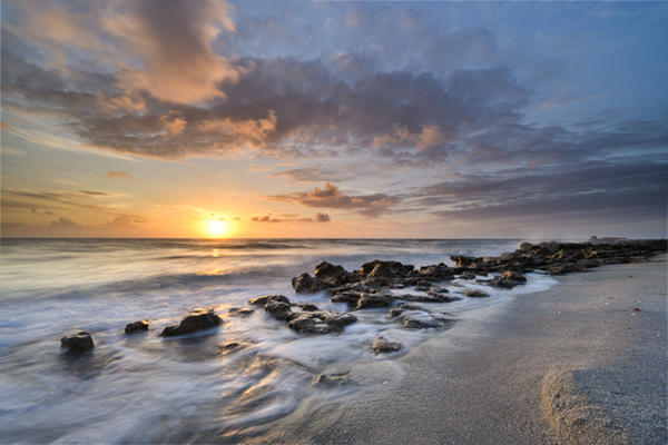
Tequesta beach at sunrise with my 14-24mm wide angle, composed to capture what captured my interest: so many sections, layers, textures, and shapes of ocean, waves, rocks, and beach. I had to have them all and there were two decisions involved in that, neither of them difficult: which lens to use and where to stand.
…Choice
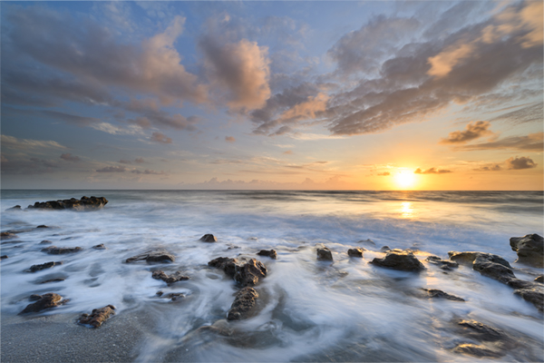
With the first Tequesta image made, I changed the composition to get a more straight-on, basic look that opened up the landscape and gave more emphasis to what was going on in the sky. It’s a different story, more of a document than an emotion. To be honest, this shot was a bit difficult, not because it involved any extreme of position or even a change of lens, but because I tend to get so into what I’m doing, I could take 15 pictures from the same place. I have to remember to vary my compositions. You might prefer one Tequesta over the other, but the idea is to have a choice, and to think up interesting ways of portraying the same conditions and elements.
Summing Up
Composition is part of the imaging process, one that includes a lot of considerations and elements, including lens choice, angle of view, time of day, quality of light, leading lines, balance, gesture, even framing rate. Your best images will come alive for you, and I think you’ll find those images result from challenges, emotions and ideas. I’ve found effective composition requires all three.
Social Media Links
You can check out Deborah Sandidge’s images, ideas, and compositional decisions on Instagram, at https://www.instagram.com/debsandidge/, Twitter, at https://twitter.com/DebSandidge, and Facebook, at https://www.facebook.com/debsandidge.


