
How to Fix Flat, Lifeless Nature & Wildlife Photos in Lightroom (VIDEO)
We’ve all come upon a beautiful scene only to discover that our images look flat and lifeless. Sometimes that’s because the light wasn’t quite right, while other times the culprit was operator failure, i.e. we used the wrong camera settings or techniques.
Whatever the reason for disappointing results, there’s a straightforward method for dramatically improving uninspiring images in Lightroom by using the three pro techniques that you’ll learn in the tutorial below. By following this advice you’ll be more inclined to rescue bland images than dump them in the trash.
Simon d’Entremont is a professional wildlife photographer based in Nova Scotia, and he’s one of Shutterbug’s most popular instructors. In this episode he demonstrates his three favorite Lightroom tools for turning dull images into those that really command attention.
Simon says that, “even if you don’t use Lightroom, these tricks are applicable to any processing software,” although the controls may be slightly different. He also explains that you can employ his advice in in various ways. You can take a subtle approach for a natural look or go further to create artistic images with extra vibrance.
His first trick has to do with adjustments to the direction of light. What he means by this is to add an effect that indicates the direction from which the light originated, and then enhancing it for extra impact. As you’ll see, this technique provides a 3-D effect and works particularly well for images shot with a long telephoto lens that eliminates much of the area surrounding your subject.
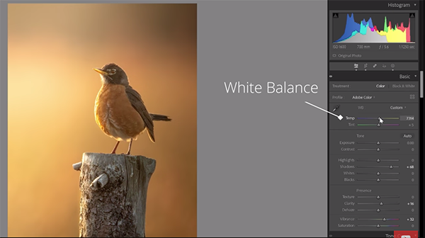
Simon’s second tip has to do with the creative use of White Balance to significantly enhance photos that are interesting but rather lifeless. Here he treats different portions of a scene selectively with Lightroom’s Temperature slider rather than by making global adjustments to the entire image.
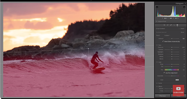
He uses a photo of a surfer to demonstrate how this works. In this case there’s a brilliant orange sky in the background, but the foreground with the surfer and waves are really dull and devoid of color because they’re in the shade. Hence, he warms the sky, and adds cool tones to the foreground while pumping up detail.
Simon’s third tip employs what he calls a “sandwich technique.” This involves darkening the top and bottom of an image to create more contrast and focus the viewer’s attention on the subject in the middle. The easiest way to do this is by adding gradients to the top and bottom of the photo and dropping exposure in both areas.
After watching this video head over to d’Entremont’s instructional YouTube channel where there’s much more to learn.
We also suggest checking out a tutorial we posted earlier, explaining the best way to create and refine masks in Lightroom by adding or subtracting objects.


