Should you Edit Photos in Color or B&W? Here’s How to Decide (VIDEO)
As Hamlet one said: “To edit in color or to edit in b&w, that is the question.” Well, not really, but it’s a question you should ask yourself regardless of the type of images you shoot.
Today’s very interesting discussion will help you make the right choice, depending upon the photo in question and the mood you want to create. Photographer Dave Herring explains how he determines which way to go.
An original thinker himself, Herring’s tutorials often take a unique approach. Like other photo educators he regularly shares favorite photographic techniques, but he also addresses the cultural and philosophical values he’s acquired during his journeys.

Herring says, “I’m 70% color and 30% b&w,” but when he takes the monochrome route he does so with conviction and for very specific reasons. Interestingly, he always sets his camera’s rear LCD to monochrome, regardless of whether the final edited image will be in presented in color or b&w.
For Herring the decision comes down to one simple question: “What is more interesting in this composition; is it the color or the contrast?” A secondary consideration has to do with what’s most appropriate for a particular subject; namely, is it simplicity or is it complexity? Herring’s view is this: “I find b&w to be a little more minimal, more simplistic, and a little more isolating.” Conversely, he views color imagery as complex, richer, and “more robust.”
Herring notes that today’s sophisticated processing tools enable us to present an alternate reality—regardless of whether the image one creates is monochrome or in color. His view is that b&w imagery offers abundant opportunities in this regard because we’re not required to depict reality as it is. Moreover, we’re all accustomed to viewing the world in color.

Similarly, Herring says that when editing color photos we can also create an alternate reality by manipulating color and tones. Or in his words, “We edit color photos to present our version of reality and what we would prefer to see.”
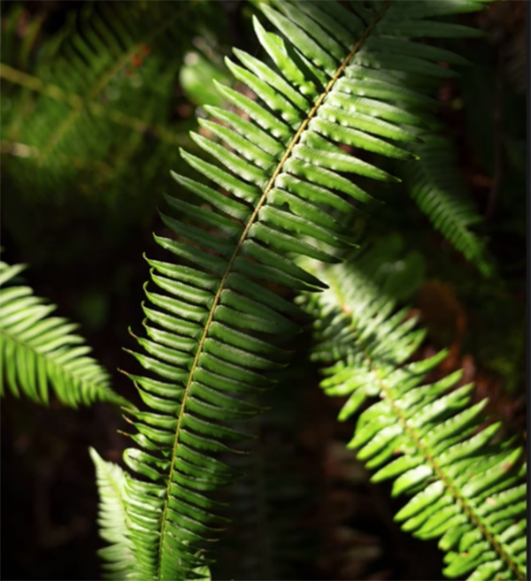
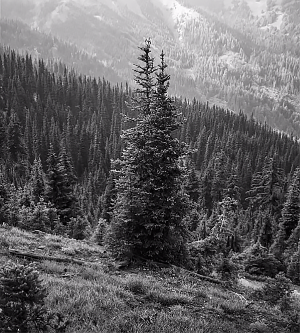
After describing his thought process Herring presents several images from a recent trip to the Olympic Peninsula—some in color and others in b&w. And then he explains why and how he took the specific approach he did. It’s all very interesting and informative. You can find more insights and techniques by visiting Herring’s YouTube channel, so be sure to do that as soon as you have time.
And for those times that you edit in color and want to get the job done quickly and efficiently, don’t miss our earlier tutorial with a basic four-minute color-grading method designed for those new to Lightroom.


