Depth of Field: What You Don’t Know is Holding You Back (VIDEO)
The thoughtful use of depth-of-field (DOF) techniques is a key component of every image you capture. And this holds true for landscapes with maximum sharpness throughout the frame, portraits with soft backgrounds, and clean street scenes with a minimum of clutter. Do it right and you have a successful image but make a mistake and the photo will suffer.
This tutorial from John Gress takes a deep dive into this oft-ignored and frequently misunderstood topic that can quickly make or break a shot. Gress is a successful commercial photographer whose work has been used by some of America’s largest companies, media outlets, and ad agencies for the past 20 years.
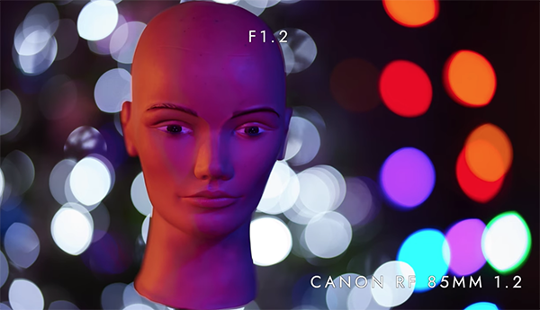
Gress describes the essence of the lesson like this: “Whether you’re obsessed with bokeh or always set your camera to f/5.6 or f/8, understanding and using depth-of-field to advantage is crucial for improving your skills.” The emphasis today is on portraiture, but everything you’ll learn can be applied to other genres as well.

Many novice photographers are under the misimpression that their best option is to shoot with prime lenses at maximum aperture. But as you see, there’s a whole lot more to DOF than just soft, beautiful backgrounds. In fact, there are certain situations in which you’ll be better served by stopping down the lens to expand the range of focus (rather than doing the reverse).
The tutorial begins with a brief overview of how DOF works, and why it’s so essential if capturing images with maximum impact is your goal. Gress then tackles the subject of bokeh, demonstrating the best way to achieve this popular effect.
You’ll also learn the various ways that changing the f/stop will affect sharpness and other key attributes in a photograph. The techniques described are super easy to follow because Gress illustrates them with practical demonstrations, real world examples, and clear comparisons.

Gress concludes the video with several DOF strategies for controlling what is in focus and what isn’t. Bottom line, this episode is guaranteed to help you create more interesting and compelling imagery. His instructional YouTube channel includes more helpful videos like this one, so be sure to take a look.
We also recommend watching a tutorial we featured recently with another accomplished pro who compares full-frame cameras with crop sensor models to illustrate the benefits and disadvantages of each format and the impact sensor size has on your style of photography. Hint: bigger isn’t always better.


