Don’t Confuse the Crop Tool with Image Size When Editing a Photo (VIDEO)
Today’s tutorial from the Visual Center YouTube channel tackles a common mistake when editing images in Photoshop; namely, confusing the Crop tool with image-size adjustments. In barely five minutes you’ll learn how to avoid this error and gain a firm understanding of these “crucial” variables.
Instructor Carlos Sanchez demonstrates the correct way to set the aspect ratio of an image using Photoshop’s simple Crop tool, and you’ll discover how to separately adjust image size. He also has you covered when it comes to fitting a printed photo into a frame, whether it’s a custom or standard size.
Sanchez puts it like this: “While the Crop tool does affect image size a little bit, it’s mostly for setting your aspect ratio”—in other words modifying the relationship between the width and height of a photo. As you’ll see, his unedited portrait photo has a ratio of 2:3 because that’s the native aspect ratio of his camera.
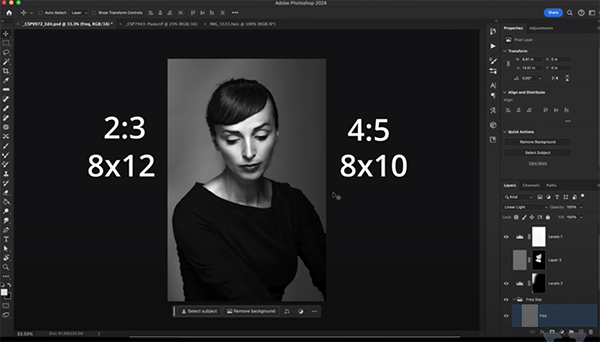
But here’s the conundrum: Sanchez wants this image to fit into a standard 8×10 picture frame which has a ratio of 4:5. Without cropping the original image would require a custom 8×12 frame. This fact, according to Sanchez raises another common mistake: choosing an image size before settling on the dimensions of a frame you want to use.
As he says, “this can be a real headache, especially if you’re not familiar with standard photo frame sizes.” The reverse can also be true if you print a standard size image but you have a non-standard frame.
Unless you’re getting a photo custom-framed, here’s what Sanchez recommends: “First figure out what frame you’re getting and then size your image accordingly.” He demonstrates how easy this is to do with Photoshop’s Crop tool. By clicking on the dropdown you’ll find a variety of presets for different aspect ratios to get the job done fast—including the 2:3 ratio of Sanchez’ original image.
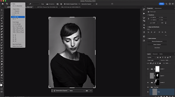
Watch how the crop guide changes when Sanchez selects an aspect ratio of 4:5. He says, “this is great because I can now recompose my image to the new ratio.” This also enables him to precisely crop his photo without guesswork before outputting the final print. He also notes this: “If I don’t want to crop anything, I can use Photoshop’s Generative Expand feature to expand the frame.”
Sanchez has several more tips that are important to understand, so be sure to watch this lesson until the end. Then head over to his instructional YouTube channel for more helpful techniques.
We also recommend watching another primer we posted recently with a basic guide to using Lightroom’s powerful Tone Curve tools when processing your photographs.
Click on “Watch on YouTube” in the window below to view Sanchez’ video.


