Most Pros Use This Camera Mode More Often Than Not (VIDEO)
You’re likely familiar with the claim by so-called purists that “You’re not a real photographer unless you shoot in Manual mode.” Since we avoid profanity on this page, let’s just say that’s simply a bunch of nonsense.
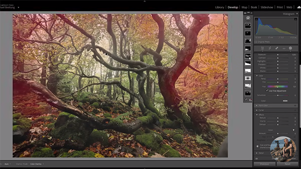
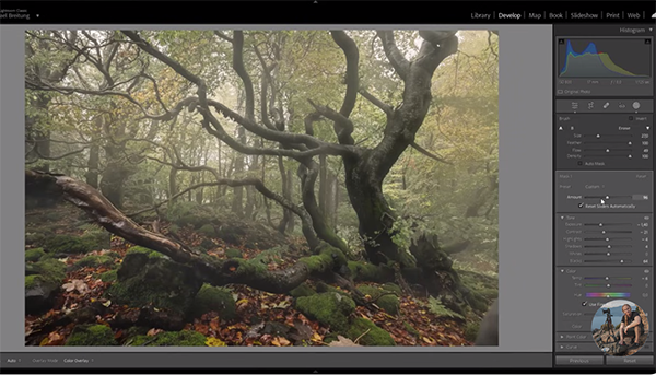
In fact, accomplished photographer Jason Vong claims that most pros use Aperture Priority mode over 90% of the time. And when this mode isn’t the right choice for the task at hand, switching the mode dial to Shutter Priority is frequently the next best choice. In less than eight minutes Vong explains when and how these two semi-automatic modes work to deliver great photos without any confusion.
Vong discusses his preference for Aperture and Shutter Priority and why they make photography “so much easier” without any sacrifice in your results. He admits that Manual mode provide optimum control and he doesn’t dissuade you from giving it a try—especially when shooting in a controlled environment with constant lighting, and have “all the time in the world.” But unless you work in the studio, how often do you really do that?

In fact, one challenge faced by outdoor photographers is ever-changing light. And in Manual mode this often means constantly changing your settings; a very frustrating task that will really slow you down and can even mean missing a fleeting shot.
Wong refers to Aperture and Shutter priority as “hybrid Auto and Manual modes” in that it’s up to you to select the f/stop or shutter speed you prefer and then leave it up to the camera to determine the appropriate other setting on your behalf. Vong moves on to the specifics of Aperture Priority and he reveals a few tricks for using this mode in a better way.
Aperture Priority is typically identified on the camera’s mode dial with an A or AV. A key advantage to this preferred mode is that it enables you to control depth-of-field and achieve soft, blurry backgrounds that accentuate the primary area within the frame. Vong walks you through other important factors when photographing stationary or slow-moving subjects.

In instances when the photo is too dark or too bright, you can always use EV Compensation in conjunction with Aperture Priority to quickly and easily make the fix. In fact, we recently posted a more detailed tutorial on this technique, and we encourage you to take a look. He also explains why you should set ISO yourself, rather than using the Auto ISO option.
OK, so what about Shutter Priority? Vong recommend reserving this mode for times when you’re photographing fast action— like sports, wildlife, cars in motion and the like. This option is denoted by an S or TV on the mode dial. The second half of today’s lesson is devoted to the finer points of doing exactly that.
You can find more great tips and tricks for shooting better photos by paying a visit to Vong’s instructional YouTube channel the next time you have some time to explore.
So the next time a purist lauds Manual mode as the only way to go, ask them to explain the Hardy Weinburg Equilibrium. Hint: it has nothing to do with photography and you’ll be greeted with a blank stare—unless they happen to be an anthropologist.