Photo by Redd F on Unsplash
Can you buy a camera at a better price in Japan? Many factors suggest that this could seem like a logical conclusion. The Japanese yen has fallen in value against the US dollar over the past several months and now hovers near the psychological barrier of ¥150 to one US dollar. Skyrocketing inflation, stagnant export sales and a weak yen are exacerbating the struggles of the Japanese economy. Has this cocktail of financial havoc generated bargains for photographers?
Photo by DLKR on Unsplash
If you are planning to visit Japan or have a friend or relative living there, it may have crossed your mind that you may be able to score a deal on a new mirrorless Sony, Nikon, Fujifilm or Canon camera now that the US dollar is so strong vs the Japanese yen. It’s crossed ours, too, so we decided to do a little investigating.
By no means do we suggest that you abandon your USA retailer, and we’re definitely not suggesting you attempt to order online from a Japanese store—if you could find one willing to sell to you. There are several good reasons not to buy a camera intended for the Japanese domestic market. For starters, you can forget about the warranty (this may differ from state to state) and most aftermarket assistance. If you use a bank card you’ll be charged international transactions fees, and you may not get the best exchange rate. Then there are the shipping and insurance costs.
Nonetheless, we’ve compiled some data that we hope you find interesting.
The Facts
We checked the pricing of the eight best-selling mirrorless cameras at Yodobashi Camera. With 24 stores and 5,000 employees (as of April 2022), Yodobashi ranks at or near the top of every list of camera retailers. Their 12-month sales for fiscal year ending 3-31-22 reached 753 billion yen—that’s more than $5-billion with a “B” in US dollars.
In addition to cameras and related equipment, Yodobashi sells computers, audio/video equipment, home appliances, watches, mobile phones, game consoles and software, books/e-books, sports/outdoor goods and more.
A visit to the Yodobashi Camera Shinjuku West (Main Store) in Tokyo is nearly an overwhelming experience for any avid photographer. I’ve had the good fortune to visit several Yodobashi locations, and every time I was absolutely flabbergasted by the product displays, range and depth of accessories and overall ambience. If you love photography and have a chance to visit Yodobashi, do so without hesitation.
Photo by Sorasak on Unsplash
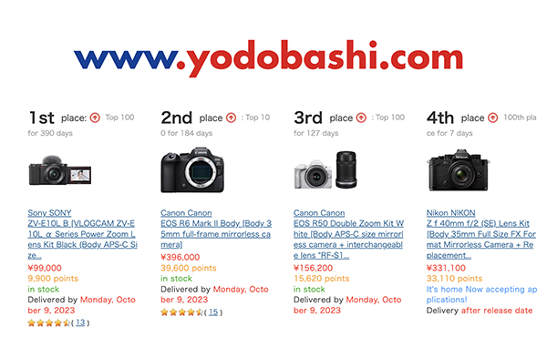
Prices: 8 Top-Selling Mirrorless Cameras at Yodobashi
All prices in yen were sourced from yodobashi.com. Yen to dollar conversion calculated at ¥149 to $1.00 US, prevailing exchange rate as this is written.
Note that registered members of Yodobashi’s Gold Points program earn discount tokens that can be spent like cash and have a value of 1 point = ¥1. The mirrorless cameras below all earn points equal to 10% of their price.
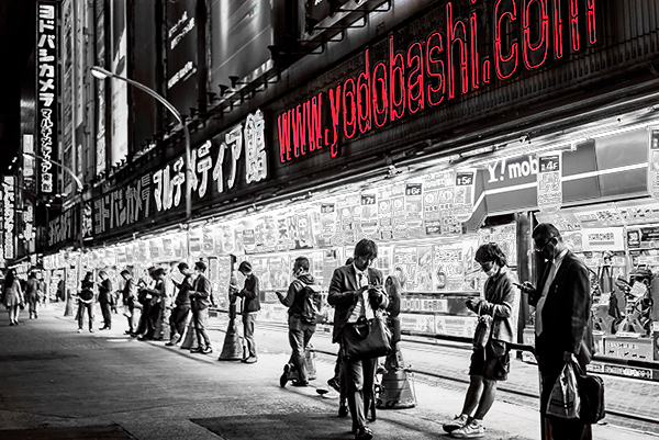
Photo by Redd F on Unsplash
Sony ZV-E10L Power Zoom Lens Kit
#1 seller and in the Top 100 for 390 days as of this writing. Price ¥99,000
Yen price converted to US dollars excluding bank fees: $664
Typical price at major US retailers: $798
Available from Amazon for $798
Canon EOS R6 Mark II Body Only
#2, Top 100 for 184 days. Price ¥396,000
Yen price converted to US dollars excluding bank fees: $2658
Typical price at major US retailers: $2499
Available from Amazon for $2499
Canon EOS R50 Double Zoom Kit
#3, Top 100 for 127 days, ¥156,200
Yen price converted to US dollars excluding bank fees: $1048
Typical price at major US retailers: $1029
Available from Amazon for $1029
Nikon Z f, 40mm f/2 SE Lens Kit
#4, ¥331,000 (preorder)
Yen price converted to US dollars excluding bank fees: $2221
Typical price at major US retailers: $2236
Preorder directly from Nikon for $2239
Sony a6700, 16-50mm Zoom Kit
#5, 38 days in Top 100, ¥216,890
Yen price converted to US dollars excluding bank fees: $1456
Typical price at major US retailers: $1498
Available directly from Sony for $1499
Fujifilm X-T5 Body Only
#6, Top 100 for 160 days, ¥257,400
Yen price converted to US dollars excluding bank fees: $1728
Typical price at major US retailers: $1699
Available from Amazon for $1699
Sony 7RV Body Only
#7, 173 in Top 100, ¥550,400
Yen price converted to US dollars excluding bank fees: $3694
Typical price at major US retailers: $3899
Available from Amazon for $3898
Nikon Z fc, 16-50mm SL Lens Kit
#8, Top 100 for 172 days, ¥150,700
Yen price converted to US dollars excluding bank fees: $1011
Typical price at major US retailers: $999
Available from Amazon for $996

Photo by Ben Cheung via Pexels
Conclusion: Are cameras cheaper in Japan?
Nah, camera prices in Japan are not lower than in the US after all, at least when we examine the pricing levels of Japan’s biggest camera retailer. In most cases, they’re slightly higher. And if you add the inescapable bank fees, warranty coverage, shipping charges and so forth, you’re much better off buying here in the good old USA.
Yes, there are anomalies here and there—like the price of the Sony ZV-E10L Power Zoom Lens Kit—but keep in mind that all pricing examples given here are snapshots of an active market. In other words, the discrepancies may be temporary.
Based on my firsthand experience, you will not find lower prices in Japanese camera stores, but you will find a mind-blowing assortment of accessories, oddities, unique items and other irresistible things that make enthusiastic photographers break out the bank card. If you ever have the opportunity to visit one, go ahead and challenge your self-control.
—Jon Sienkiewicz
(As an Amazon Associate, Shutterbug earns from qualifying purchases linked in this story.)