
Visual Hierarchy in Nature Photos: Pick the Key Element in Your Scene (VIDEO)
Experienced landscape photographers understand the importance of simplifying complicated vistas so that viewers aren’t confused by a myriad of elements within the frame from foreground to background. In that sense, a great photo is one that helps direct one’s eye through the frame.
Artists, graphic designers, and illustrators often think of “visual hierarchy” as they work, and as a photographer you should do the same. In simple terms this means asking yourself, “What’s the most important element in my scene,” and capturing the image with that in mind. Or as photographer Mike Smith puts it, “To make an effective image you want to structure it so that what you see as important is seen by the viewer as important” when looking at your work.
On rare occasions, simple cropping is all it takes to simplify a confusing scene. Typically, though, more thought is required to make sense out of the chaos you see through the viewfinder. Once you’ve identified the key subject of the scene, there are several effective ways to give that element more emphasis and weight.
In the tutorial below British landscape photographer Mike Smith provides a helpful checklist for getting the job done. He demonstrates how to use scale, color, size, and other attributes to accentuate the key area in a photo and capture images that others don’t find confusing.
Iconic Hungarian-American photojournalist Frank Capa once remarked, “If your photos aren’t good enough, you’re not close enough,” and that’s an apt lead-in to Smith’s discussion of scale. The point here, according to Smith, is basically this: “Our brains assign a high level of importance to things that are bigger than others.” He then provides a few shots taken from the same camera position to illustrate how this works.
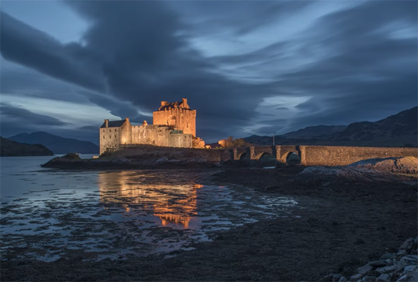
Smith also demonstrates how to use color to move an object up the hierarchy of importance to capture a viewer’s attention. In this case he uses of photo of a castle bathed in late-day golden light. This image works because both the sky and water in the foreground have dark bluish tones that make the yellowish castle really stand out.

The thoughtful use of contrast is another tool you can use the create a heightened sense of importance. If you have difficultly discerning subtle variations in contrast, Worth suggests switching the camera to b&w. By doing that subtle differences between areas in the frame become readily more apparent.
Worth offers several more great tips for emphasizing the key element in a photo, including the importance of proper alignment among elements, and how exposing for a silhouette can be super effective with the right light. The bottom line is this: carefully scrutinizing a scene and following Smith’s advice is more likely to yield better images than would a bunch of more exotic gear.
After watching this lesson pay a visit to Smith’s instructional YouTube channel where you’ll find an abundance of great ideas for improving your work. On a related note, we also recommend watching a tutorial we posted earlier, explaining how to use depth and dimension for landscape photos with maximum impact.


