
How Pros Use Color to Shoot Breathtaking Travel & Nature Photos (VIDEO)
Landscape photographers think a lot about the color palette when editing their work. But thoughtfully optimizing color in the camera is equally important and will save you plenty of time behind the computer.
Today’s quick tutorial discusses the task of shooting in the field with intention, so the tones in your images are as natural or pumped up as you wish. The lesson begins with an overview of color theory, followed by practical examples that put your new-found knowledge to work. Smith also provides several Lightroom tips near the end of the video that will enable you to refine your results.
Instructor Mike Smith is a professional landscape photographer who regularly posts behind-the-scenes lessons sharing the secrets to his success. You’ll have to cut him some slack for spelling the word “color” incorrectly throughout the nine-minute video, but that’s what happens when you’re based in the UK.

The proper use color is more complicated than some people realize. As Smith notes early on, “Colors can make things stand out in your photographs, but they can also hide things away.” He further explains that colors can complement and harmonize with one another or cause visual conflict.
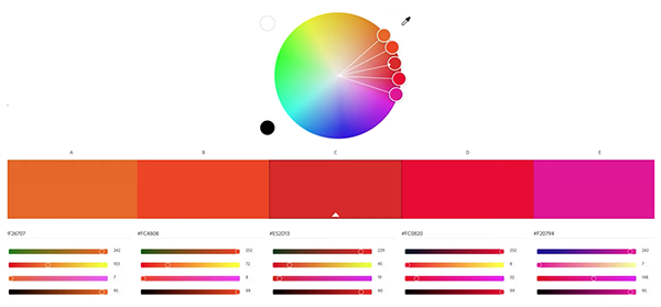
Smith begins the theory portion of the lesson by introducing the RBY (Red Blue, Yellow) color wheel developed by Isaac Newton. He then explains why the more recent RGB (Red, Green, Blue) color wheel is more appropriate for digital photographers who want to understand how color impacts their imagery.
Color can be broken down into its constituent parts, namely saturation, value, and hue. Smith explains that saturation describes the intensity of colors, while the value (or luminosity) of a color basically describes how bright or dark it is. He also has a clear explanation for hue, and demonstrates how Photoshop’s Color Picker illustrates all this when you drag the slider up or down—with numerical values for the hue on the right. You’ll also learn how color temperature factors into the equation.
Smith move on to a discussion of how all this theory works in practice—both in the field and when sitting behind a computer. As he says, “I tend to use color in my landscape photography to represent a feeling I want to create for the viewer when they look at my photographs.”
For example, pushing White Balance toward the blues will evoke a moody, colder feel, while enhancing the yellows does the opposite. In either case it’s important to be careful about how much you add or take away. The video includes much more about using color while shooting or editing, so be sure to watch until the end.
After you’re done head over to Smith’s instructional YouTube channel for more tips and tricks.
And be sure to check out an earlier tutorial we posted from another expert, with five in-camera do’s and don’ts for capturing more compelling outdoor photographs.


